
Bar charts are one of the most common and versatile data visualization tools used by developers, analysts, and decision-makers across industries. They are especially useful when you want to compare and display a large amount of data quickly and clearly. By organizing data into easily distinguishable vertical bars, bar charts can convey information quickly and effectively, making them a popular choice for presenting data in reports, dashboards, and presentations.
There are many scenarios where bar charts are particularly useful. For example, they can be used to display sales data, compare different product lines, track progress towards goals, or visualize survey results. Bar charts are also an excellent tool for identifying trends and outliers, for highlighting differences between categories or groups, or even display distributions and histograms.
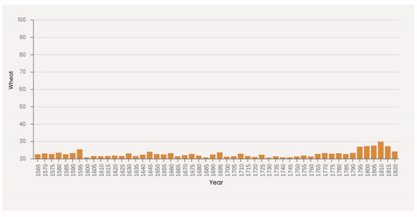
Animated bar chart
Overall, bar charts are a highly effective way to represent numerical data in an accessible and understandable format. By animating them with React and D3, you can take your visualizations to the next level, creating interactive and engaging data displays that capture the attention of your audience and convey complex information in an intuitive and informative way.
In this post, I'll show you how to create a bar chart using React and D3, two popular frameworks for building web applications and data visualizations. We'll start with a basic, static bar chart that displays some sample data, and then we'll add some animations to make it more engaging and interactive.
Building a static bar chart
Before we dive into animating bar charts, let's first build a simple static bar chart to understand the basic principles of using D3 and React together. We will start with a basic dataset, create a simple SVG container, and then draw the bars for each data point. Once we have a working static bar chart, we can then move on to making it animated.
The dataset
We will start with a dataset. The dataset that I'll use is a json file having an array of records. Each record contains three properties: "year", "wheat" and "wages".
[
  { "year": "1565", "wheat": 41, "wages": 5 },
  { "year": "1570", "wheat": 45, "wages": 5.05 },
  { "year": "1575", "wheat": 42, "wages": 5.08 },
  { "year": "1580", "wheat": 49, "wages": 5.12 },
  { "year": "1585", "wheat": 41.5, "wages": 5.15 }
  // rest of the dataset
]
We are going to show the distribution of wheat values time. Each item in this dataset will represent a bar where the height of the bar will be the value of "wheat" property.
To easily read the dataset from a URL, I'll be using d3.json() function. I create a custom React hook to that.
const useBarchartData = () => {
  const [data, setData] = useState();
  useEffect(() => {
    json(
      'https://raw.githubusercontent.com/vega/vega/main/docs/data/wheat.json'
    ).then((dataset) => setData(dataset));
  }, []);

  return data;
};
Creating the SVG container
The first step in creating our bar chart is to create an SVG container. In React, we can use the svg element and set its width and height attributes to create an SVG container that is the right size for our chart:
const BarChart = () => {
  const { width, height, margin } = dimensions;
  const boundedDimensions = {
    width: width - margin.left - margin.right,
    height: height - margin.top - margin.bottom,
  };

  // Read the dataset
  const data = useBarchartData();

  return (
    <div id="wrapper">
      <svg width={width} height={height}>
        <g transform={`translate(${margin.left},${margin.top})`}>
          // Bars will be drawn here
        </g>
      </svg>
    </div>
  );
};
Drawing the bars
Now that we have a container for our chart, we can start drawing the bars. We have categorical dimension for our x axis (i.e. list of "year" attributes), and continuous values (i.e. "wheat" values) for y axis. Therefore, d3.scaleBand() is the right choice as band scales are suitable for charts with ordinal or categorical dimensions.
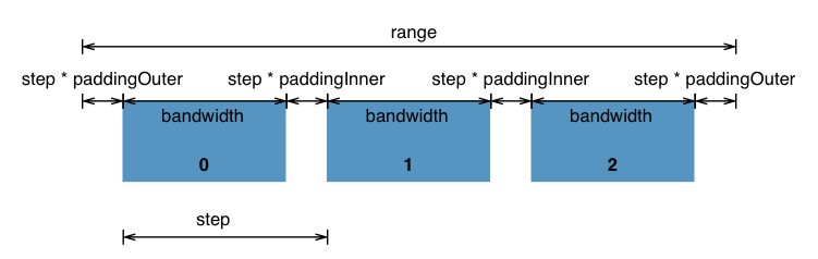
Band scale visual demonstration Image source
we can use the scaleLinear function to create a scale that maps our data "wheat" values to pixel values on the chart. We will use this scale to determine the height of each bar.
// Define accessors
const xAccessor = (d) => +d.year;
const yAccessor = (d) => +d.wheat;

const barPadding = 0.2;
const xDomain = data.map((d) => xAccessor(d));

// Define Scales
const xScale = d3
  .scaleBand()
  .domain(xDomain)
  .range([0, boundedDimensions.width])
  .padding(barPadding);

const yScale = d3
  .scaleLinear()
  .domain(d3.extent(data, yAccessor))
  .range([boundedDimensions.height, 0])
  .nice();
Next, we can use the map function to create a rect element for each value in our data array. We set the x, y, width, and height attributes of each rect element based on the value of the corresponding data point and the scales we created:
<svg width={width} height={height}>
  <g transform={`translate(${margin.left},${margin.top})`}>
    {data.map((d, i) => (
      <g key={i}>
        <rect
          x={xScale(xAccessor(d))}
          y={yScale(yAccessor(d))}
          width={xScale.bandwidth()}
          height={boundedDimensions.height - yScale(yAccessor(d))}
          fill="#E6842A"
          className="bar"
        />
      </g>
    ))}
  </g>
</svg>
Please note that for the height values of rect elements, we subtract the yScale() calculation from the chart height, because SVG coordinate (0, 0) starts from top left of the screen. Therefore height - yScale(yAccessor(d)) makes the bars begin from the bottom of the SVG container rather than the top. And there you have it! We now have a basic static bar chart.

Although bar chart is drawn, it's hard to really read it. There is no x and y axes and labels. So next step is to create axes and labels.
Creating the axes
To create the axes, we can utilize the scales we already defined. I defined separate React component for each axis.
We need to move the x axis to the bottom of the chart, so we use transform property to conveniently shift the entire axis and its ticks to the bottom. Then by using the map function, we define each tick and position it accordingly. Finally, we add some styling to change the font and rotate the tick labels to prevent them from overlapping.
const BarAxisBottom = ({ width, height, xScale }) => {
  return (
    <g className="axis xaxis" transform={`translate(0, ${height})`}>
      <line x1={0} x2={width} stroke="currentColor" />

      {xScale.domain().map((tickvalue, i) => (
        <g
          key={i}
          transform={`translate(${
            xScale(tickvalue) + xScale.bandwidth() / 2
          },0)`}
        >
          <line x={xScale(tickvalue)} y2={6} stroke="currentColor" />
          <text
            dy=".71em"
            fill="currentColor"
            style={{
              fontFamily: 'sans-serif',
              fontSize: '11px',
              textAnchor: 'end',
              dominantBaseline: 'middle',
              rotate: '-90deg',
              transform: `translateX(-10px) translateY(-${
                xScale.bandwidth() / 2
              }px)`,
            }}
          >
            {tickvalue}
          </text>
        </g>
      ))}
    </g>
  );
};
Similarly, for y axis we have:
const BarAxisLeft = ({ width, height, yScale }) => {
  return (
    <g className="axis yaxis">
      <line x1={0} y2={height} stroke="currentColor" />

      {yScale.ticks().map((tickvalue, i) => (
        <g key={i} transform={`translate(0,${yScale(tickvalue)})`}>
          {/*  horizontal grid lines */}
          <line x2={width} stroke="currentColor" strokeOpacity="0.2" />

          <line x2={-6} stroke="currentColor" />
          <text
            // x={-15}
            dy={'.32em'}
            fill="currentColor"
            style={{
              fontSize: '10px',
              textAnchor: 'end',
              transform: 'translateX(-15px)',
            }}
          >
            {tickvalue}
          </text>
        </g>
      ))}
    </g>
  );
};
For axes labels we simply need to create two text elements and place them the right x and y positions.
<text
  x={boundedDimensions.width / 2}
  y={height - margin.bottom + 20}
  textAnchor="middle"
  fontSize="12px"
>
  Year
</text>
<text
  transform={`translate(-40,${
    boundedDimensions.height / 2
  }) rotate(-90) `}
  style={{
    fontSize: '11px',
  }}
>
  Wheat
</text>
Overall, the code snippet inside out BarChart component would look like this:
<BarAxisBottom
  width={boundedDimensions.width}
  height={boundedDimensions.height}
  xScale={xScale}
/>
<BarAxisLeft
  width={boundedDimensions.width}
  height={boundedDimensions.height}
  yScale={yScale}
/>
<text
  x={boundedDimensions.width / 2}
  y={height - margin.bottom + 20}
  textAnchor="middle"
  fontSize="12px"
>
  Year
</text>
<text
  transform={`translate(-40,${
    boundedDimensions.height / 2
  }) rotate(-90) `}
  style={{
    fontSize: '11px',
  }}
>
  Wheat
</text>
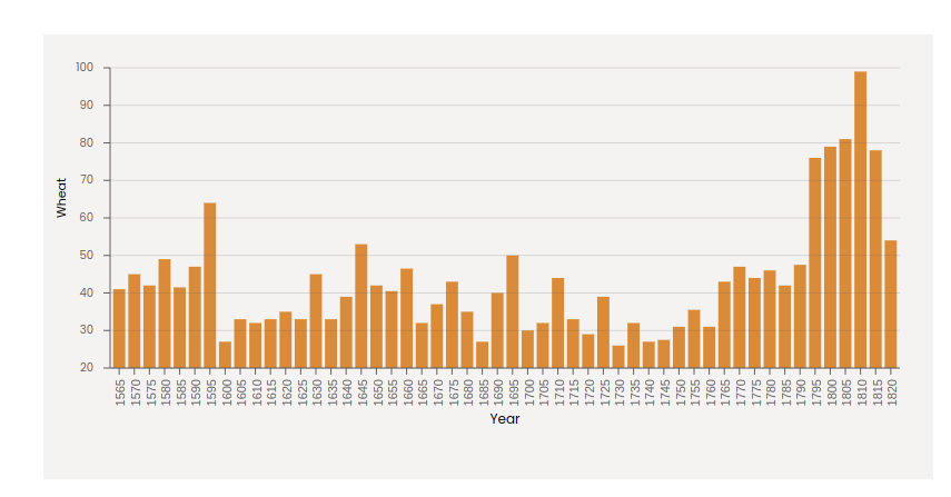
Bar chart with axes and labels
Adding interactivity to the bar chart
we will add interactivity to our static bar chart to make it more engaging and informative. We will use the React library to handle the user interactions. Here are the steps we will follow:
Add event listeners to our bar chart. We will use
Reactto add event listeners for mouseover and mouseout events. These events will be triggered when the user hovers over or leaves a bar.Add tooltips to our bar chart. In my How to add a tooltip to a line chart post, I explained how to create a custom tooltip. However, here we will use the visx library to add tooltips that display information about each bar when the user hovers over it. These tooltips will provide more detailed information about the data that is being displayed.
visx is a suite of several low-level standalone packages for building visual interfaces with React. Particularly, we will use @visx/tooltip package. It makes it "easy to add Tooltips to a visualization and includes hooks, higher-order component (HOC) enhancers, and Tooltip components."
We import the hook and Tooltip component from this package:
import { useTooltip, Tooltip } from '@visx/tooltip';
We then can get values and functions we need from this hook.
import { useTooltip, Tooltip } from '@visx/tooltip';

...
const {
  showTooltip,
  hideTooltip,
  tooltipLeft,
  tooltipTop,
  tooltipOpen,
  tooltipData,
} = useTooltip();
Now we add event listeners to our bars.
<rect
  x={xScale(xAccessor(d))}
  y={yScale(yAccessor(d))}
  width={xScale.bandwidth()}
  height={boundedDimensions.height - yScale(yAccessor(d))}
  fill="#E6842A"
  className="bar"
  // Add event listeners
  onMouseOver={(e) => handleMouseOver(e, d)}
  onMouseOut={() => hideTooltip()}
/>
We define the handleMouseOver() function. This function will receive the hovered bar, get its x and y values, and then updates the tooltipTop, tooltipLeft and tooltipData and displays the tooltip.
const handleMouseOver = (e, d) => {
  const x = xScale(xAccessor(d));
  const y = yScale(yAccessor(d));
  showTooltip({
    tooltipLeft: x + xScale.bandwidth(),
    tooltipTop: y - margin.top - 50,
    tooltipData: d,
  });
};
Now we need to create a Tooltip component after the SVG container and pass the props. We use tooltipOpen to only display the tooltip when a bar is hovered. Please note that the parent div container, which holds the SVG and Tooltip component must have a relative position to show the tooltip correctly on top of the hovered bar.
{
  tooltipOpen && (
    <Tooltip left={tooltipLeft} top={tooltipTop} className="bar-tooltip">
      <div>
        <div>
          <p>
            <strong>Year: </strong>
            {tooltipData.year}
          </p>
          <p>
            <strong>Wheat: </strong>
            {tooltipData.wheat}
          </p>
        </div>
      </div>
    </Tooltip>
  );
}
We change the color of the hovered bar using CSS properties.
.bar:hover {
  fill: #684664;
}
Here's the result.
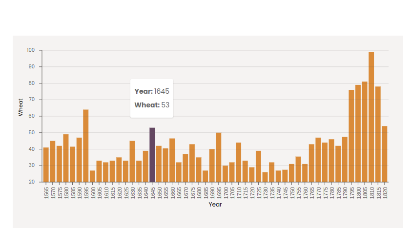
Bar chart with tooltip
Animating the bar chart with React Spring
Let's explore how to make our bar chart come to life with the React Spring animation library. React Spring is a powerful animation library for React applications that makes it easy to create complex and natural-looking animations with minimal setup. It uses the physics-based animation model to create smooth, springy, and interactive animations. They have quite a bit of examples show casing how to use the library.
To use React Spring, we first need to install it via npm. We can do this by running the following command in our terminal:
npm install react-spring
Once installed, we can import the necessary functions from React Spring into our project. The most commonly used function is useSpring, which returns an object with animated values that we can use to interpolate and animate our SVG elements.
Using useSpring, we can create animations that respond to user interactions, such as hovering or clicking on a bar, or that update automatically based on changes to our data. We can also control the easing and duration of the animations to create the desired effect.
In this section, we will add an animation to our bar chart that causes the bars to grow from the bottom to their full height when the chart is first loaded.
We will use the useSpring function to create the animations, and we will pass the animated values to our SVG elements using the style attribute. By doing this, the properties of the SVG elements will be updated as the animation progresses, creating the desired effect.
Once we have added our animations, our static bar chart will become an engaging and interactive data visualization that is sure to capture the attention of our audience.
The bars are actually rect elements, so I will move the code that creates rect elements into a separate component. Therefore, we'll define our AnimatedBar as follows:
import React from 'react';
import { useSpring, animated } from '@react-spring/web';

const AnimatedBar = ({ x, y, width, height, onMouseOver, onMouseOut }) => {
  const springStyle = useSpring({
    config: {
      duration: 5000,
    },
    from: {
      height: 0,
    },
    to: {
      height: height,
    },
  });

  return (
    <g>
      <animated.rect
        x={x}
        y={y}
        width={width}
        fill="#E6842A"
        className="bar"
        style={{
          transform: springStyle.height.to(
            (h) => `translateY(${height - h}px)`
          ), // Adjust position based on height
          height: springStyle.height,
        }}
        onMouseOver={onMouseOver}
        onMouseOut={onMouseOut}
      />
    </g>
  );
};
We use animated.rect component is used to create a rectangle element that will be animated. The style prop is where the magic happens. The transform property uses the to method of the springStyle.height object to apply a CSS transform to the rectangle. The to method takes a function that calculates the position of the rectangle based on its current height. In this case, the function subtracts the current height from the total height of the bar, height - h, and uses that value to translate the rectangle vertically, translateY(${height - h}px).
And there you go! We have an animated bar chart.
Animated bar chart
You can play with different easing functions to change the look and feel of the animation by affecting the animation speed.
You can find all the code at this repo along with previous posts' code.
Thank you for reading this blog. You can follow me on Linkedin or Twitter, and please reach out if you have any comments, or interested in any custom visualization.