
Exploring job trends in the data science industry can reveal insights into the skills and experience employers are seeking, and help job seekers identify promising career opportunities. In this blog post, we will take a deep dive into a dataset of data science jobs in the US, exploring trends in job titles, companies, and job announcement platforms. We will also use topic modeling to extract insights from job titles. Finally, we will build an interactive dashboard with React and D3 to visualize our findings in a way that allows users to explore and analyze the data in real-time.

Image generated by Muse text-to-image generation
Nevertheless, I decided to split this tutorial into two parts: In the first part we will do all the data analysis and exploration in Python. And we will create an interactive dashboard to work with the processed data in the second part of this tutorial.
Our goal is to provide a comprehensive guide to exploring and analyzing data science job trends, using real-world data and techniques. We chose this topic because the demand for data scientists is growing rapidly, and understanding the job market is essential for both job seekers and employers. We will begin by collecting and preparing the data, using a dataset that we feel is representative of the industry. We will then perform exploratory data analysis using Python, identifying trends in job titles, companies, and job announcement platforms. Next, we will use topic modeling to extract insights from job titles, looking for common themes and skills that are in high demand.
Finally, we will build an interactive dashboard with React and D3 to visualize our findings in a way that allows users to explore and analyze the data in real-time. We will showcase multiple visualizations, such as bar charts, heatmaps, and word clouds, that will be linked together to provide a cohesive and intuitive experience.
We believe that this approach will provide readers with a comprehensive guide to exploring and analyzing data science job trends. By combining real-world data with industry-standard tools and techniques, we hope to empower readers to gain insights into the job market, identify promising career opportunities, and make data-driven decisions.
Collecting and Preparing the Data
Before we can begin our analysis, we need to collect and prepare our data. We are going to use a dataset from Kaggle, 2023 Data Scientist Job Descriptions. It's a very recent dataset, which makes it even more interesting. We download the file and save it locally for easy access.
# Read and load the file
df = pd.read_csv('ds_jobs.csv')
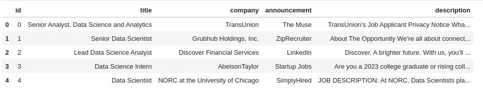
Image below shows a few rows of this dataset.
Once we have our dataset, we need to clean it up to make sure it is consistent and usable. This may involve removing duplicates, correcting errors, filling in missing values, and converting data types as needed. Although, it's already mentioned on Kaggle that this dataset has no missing value, let's take a look and make sure of it.
# Get statistics about dataframe columns
df.describe(include='all')
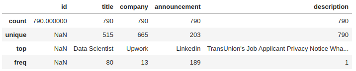
As the image shows there is no missing values in any of the columns. Depending on the type of analysis we're interested in, we may need to further pre-process our data like removing stop words, punctuation and special characters, lowercasing the text, etc. Next step is to define what kinds of analyses we want to do.
Exploratory Data Analysis (EDA)
As a data scientist, here are some interesting analyses that can be run on this dataset:
- Top Companies: Analyze the dataset to find out which companies are hiring the most for data science-related jobs.
- Most Popular Job Titles: Determine which job titles are most frequently advertised in the dataset.
- Announcements Distribution: Explore the distribution of job postings across different job announcement platforms.
- Job Descriptions Analysis: Analyze the job descriptions to identify the most common technical skills or qualifications required for data science roles.
- Job Level Analysis: Categorize the job titles in the dataset by level (e.g., junior, senior, manager) and analyze the distribution of job levels.
- Text Analysis: Perform text analysis on job titles and job descriptions to identify the most common words or phrases used in the data science job market.
- Correlation between job title and required level of education or experience for data science positions.
- Word Cloud: Generate a word cloud to visualize the most common words in the job titles.
- Job Title Similarity: Use clustering algorithms to group similar job titles together and identify any patterns in the way companies name their job titles.
- Topic modeling on job titles: To gain insights into the most common themes and subtopics that are present in data science job titles
- Average salaries for data science positions by job title and/or company. This analysis can provide insights into the earning potential of different data science roles and can help job seekers negotiate salaries and benefits.
We are going to work on some of them, and the remaining ones can be a good exercise for you. 🙂
For visualizations in python I will be using Bokeh.
"Bokeh is a Python library for creating interactive visualizations for modern web browsers. It helps you build beautiful graphics, ranging from simple plots to complex dashboards with streaming datasets. With Bokeh, you can create JavaScript-powered visualizations without writing any JavaScript yourself."
What is the distribution of hiring companies? To answer this question, we need to have the number of job posting for each company.
Top ten companies having the most job ads are displayed below, and surprisingly it's not any of the FAANG companies. Of course it's because our dataset is very small.
Upwork                              13
Walmart                             12
Dice                                10
Booz Allen Hamilton                 10
Cardinal Health                      6
SynergisticIT                        5
Intermountain Healthcare             4
Staffigo Technical Services, LLC     4
Staffigo                             4
Guidehouse                           4
Here's the code that extracts job posting for companies and creates a line chart showing the distribution of jobs over companies.
# Extract companies (665 companies)
companies = df['company'].value_counts().rename_axis('company').reset_index(name='counts')

source = ColumnDataSource(data=companies)

# Create line chart
p = figure(height=350, width=600, title=f'Distribution of hiring companies', tools="")
p.line(x='index', y='counts', line_color='red', source=source, line_width=2)

# rotate labels by 45 degrees
p.xaxis.major_label_orientation = 3.14/4
ticks = [0, 20, 40, 100, 150, 200, len(companies) - 1]
p.xaxis.ticker = ticks
xlabel_ticks = {}
for t in ticks:
    xlabel_ticks[t] = companies['company'][t]
p.xaxis.major_label_overrides = xlabel_ticks
p.xaxis.axis_label = 'Companies'
p.yaxis.axis_label = 'Counts'
p.xgrid.grid_line_color = None

show(p)
Because there are 665 companies, I only show several of them on the x-axis to prevent cluttering the plot.
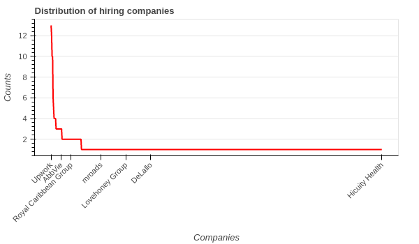
Except for the first few companies, others only have posted one job according to our dataset.
Using almost the same code with slight change, we can see the distribution of job postings across different job announcement platforms.
# Extract job announcements
job_announcements = df['announcement'].value_counts().rename_axis('announcement').reset_index(name='counts')

source = ColumnDataSource(data=job_announcements)

# Create line chart
p = figure(height=350, width=600, title=f'Distribution of job announcement platforms')
p.line(x='index', y='counts', line_color='red', source=source, line_width=2)

# rotate labels by 45 degrees
p.xaxis.major_label_orientation = 3.14/4
ticks = [0, 20, 40, 100, 150, 200]
p.xaxis.ticker = ticks
xlabel_ticks = {}
for t in ticks:
    xlabel_ticks[t] = job_announcements['announcement'][t]
p.xaxis.major_label_overrides = xlabel_ticks
p.xaxis.axis_label = 'Platforms'
p.yaxis.axis_label = 'Counts'
p.xgrid.grid_line_color = None

show(p)
As the image and top ten rows show, LinkedIn is the number one platform for job posting.
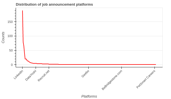
# Top-10 platforms with the most number of job postings.
LinkedIn        189
SimplyHired      79
ZipRecruiter     66
Salary.com       41
Startup Jobs     20
Adzuna           20
Glassdoor        20
Greenhouse       14
Upwork           13
Built In         13
Most common words in job titles
To find the most common words in job titles, we need:
- Get the list of all job titles
- Clean titles
- Tokenize titles
- Remove stop words
- Calculate word-frequency
- Prepare data for visualization
- Draw the plot
The following code does all the steps, please make sure to read the comments.
from nltk.tokenize import word_tokenize
from nltk.probability import FreqDist
from nltk.corpus import stopwords
from nltk import ngrams
import string
import re


# Extract job titles
job_titles = df['title'].tolist()

# Preprocessing
stop_words = set(stopwords.words('english'))
tokens = []
processed_titles = []
for title in job_titles:
    # Convert to lowercase
    title = title.lower()
    # Remove punctuation and special characters
    title = re.sub(r'[^\w\s]', '', title)
    # Tokenize title
    title_tokens = word_tokenize(title)
    # Remove stop words
    title_tokens = [token for token in title_tokens if token not in stop_words]
    tokens.extend(title_tokens)
    processed_titles.append(title_tokens)


# Calculate word frequency
fdist = FreqDist(tokens)
top_n = 20
top_words = dict(fdist.most_common(top_n))

# Prepare data for visualization
data = {'words': list(top_words.keys()), 'frequency': list(top_words.values())}
source = ColumnDataSource(data=data)

# Create bar chart
p = figure(x_range=data['words'], height=350, title=f'Top {top_n} Most Common Words in Job Titles', toolbar_location=None, tools="")
p.line(x='words', y='frequency', line_color='red', source=source, line_width=2)
p.xaxis.major_label_orientation = 3.14/4 # rotate labels by 45 degrees
p.xgrid.grid_line_color = None

show(p)
By changing the top_n variable, you can see more/less common words.
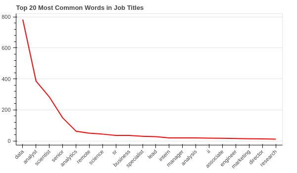
data, analyst, scientist, senior and analytics have the highest frequencies.
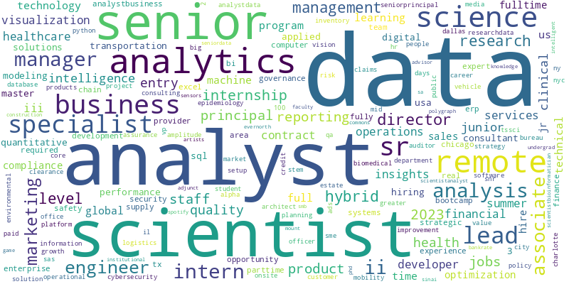
Let's generate the word cloud for that:
from wordcloud import WordCloud

# Generate word cloud
wordcloud = WordCloud(width=800, height=400, background_color='white').generate_from_frequencies(fdist)

# Visualize word cloud
plt.figure(figsize=(10, 5))
plt.imshow(wordcloud, interpolation='bilinear')
plt.axis('off')
plt.show()
# Save to a file
wordcloud.to_file('top20-wordcloud.png')
N-gram Analysis
We are going to analyze n-grams (i.e. bigrams and trigrams) in job titles to identify patterns or trends in job titles.
First let's see the distribution of titles' lengths:
# Calculate length of job titles
df['title_length'] = df['title'].apply(lambda x: len(x.split()))

# Create a histogram of title lengths
title_lengths = df['title_length'].tolist()
hist, edges = np.histogram(df['title_length'])

# Shift to center the tick labels
edges = edges - (edges[1] - edges[0]) / 2

# Create the plot
p = figure(title='Title Length Distribution',
           x_axis_label='Number of Words in Title',
           y_axis_label='Frequency')

p.quad(top=hist, bottom=0, left=edges[:-1], right=edges[1:], line_color='white')
p.y_range.start = 0

# Show the plot
show(p)
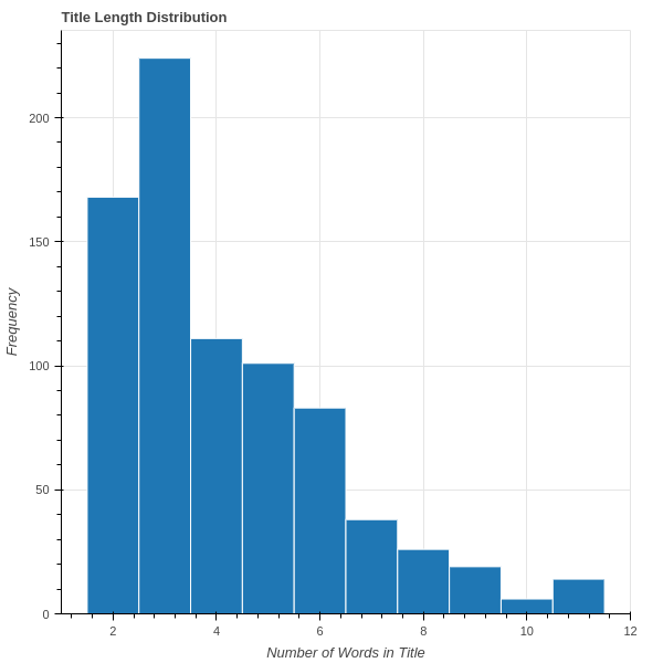
As the image shows, titles have a range of [2, 11] words, where most titles consist of less than 5 words. Now we'll calculate the bigrams and trigrams.
# Calculate bigrams and trigrams
bigrams = []
trigrams = []
for title in processed_titles:
    bigrams.extend(list(ngrams(title, 2)))
    trigrams.extend(list(ngrams(title, 3)))

# Calculate frequency distribution of bigrams and trigrams
bigram_fdist = FreqDist(bigrams)
trigram_fdist = FreqDist(trigrams)

# Print the top 10 most common bigrams
print('Top 10 most common bigrams:')
for bigram, frequency in bigram_fdist.most_common(10):
    print(bigram, frequency)

# Print the top 10 most common trigrams
print('\nTop 10 most common trigrams:')
for trigram, frequency in trigram_fdist.most_common(10):
    print(trigram, frequency)
Here's the output of the code:
Top 10 most common bigrams:
('data', 'analyst') 341
('data', 'scientist') 277
('senior', 'data') 108
('data', 'science') 43
('data', 'analytics') 35
('sr', 'data') 27
('business', 'data') 25
('data', 'specialist') 23
('lead', 'data') 20
('data', 'analysis') 16

Top 10 most common trigrams:
('senior', 'data', 'scientist') 58
('senior', 'data', 'analyst') 42
('business', 'data', 'analyst') 20
('sr', 'data', 'scientist') 16
('sr', 'data', 'analyst') 11
('staff', 'data', 'scientist') 9
('lead', 'data', 'scientist') 9
('lead', 'data', 'analyst') 9
('entry', 'level', 'data') 8
('level', 'data', 'analyst') 8
Let's create bar chart for them:
Show code
from bokeh.palettes import Category20
from bokeh.transform import linear_cmap, factor_cmap
from bokeh.palettes import Blues

# Extract the top 10 most common bigrams and trigrams
top_bigrams = bigram_fdist.most_common(10)
top_trigrams = trigram_fdist.most_common(10)

# Create a list of the bigram and trigram labels
bigram_labels = [', '.join(bigram) for bigram, _ in top_bigrams]
trigram_labels = [', '.join(trigram) for trigram, _ in top_trigrams]

# Create a list of the bigram and trigram frequencies
bigram_frequencies = [frequency for _, frequency in top_bigrams]
trigram_frequencies = [frequency for _, frequency in top_trigrams]

# Create a ColumnDataSource for the bigrams and trigrams
bigram_source = ColumnDataSource(data=dict(labels=bigram_labels, frequencies=bigram_frequencies))
trigram_source = ColumnDataSource(data=dict(labels=trigram_labels, frequencies=trigram_frequencies))

# Define a color map based on the height of the bars
# color_mapper = linear_cmap(field_name='frequencies', palette=Blues[9], low=-100, high=max(bigram_frequencies))
color_mapper = linear_cmap(field_name='frequencies', palette=Blues[9], low=min(bigram_frequencies), high=max(bigram_frequencies))


# Create a figure for the bigrams
bigram_plot = figure(y_range=bigram_labels, height=400, width=600,
                     title='Top 10 most common bigrams in job titles')
bigram_plot.hbar(y='labels', right='frequencies', height=0.8, source=bigram_source,
                 line_color='white')
bigram_plot.x_range.start = 0
bigram_plot.ygrid.grid_line_color = None

# Create a figure for the trigrams
trigram_plot = figure(y_range=trigram_labels, height=400, width=600,
                      title='Top 10 most common trigrams in job titles')
trigram_plot.hbar(y='labels', right='frequencies', height=0.8, source=trigram_source,
                  line_color='white')

trigram_plot.x_range.start = 0
trigram_plot.ygrid.grid_line_color = None

# Show the plots
show(bigram_plot)
show(trigram_plot)
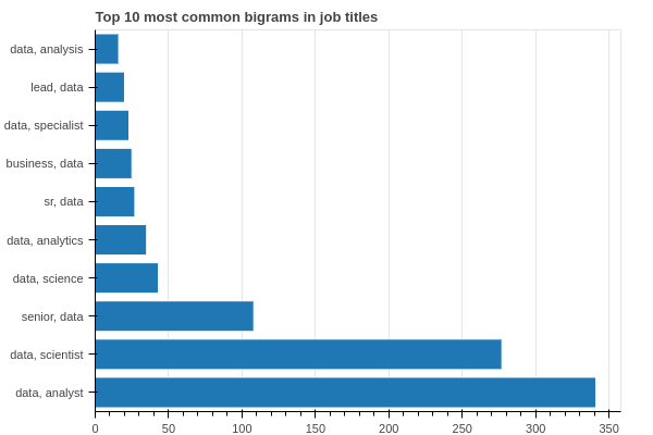
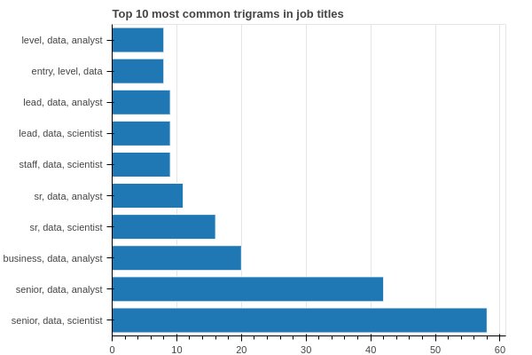
It seems that demand for data analysts is even higher than data scientists. Also, senior level positions are pretty hot too, unlike entry-level ones.
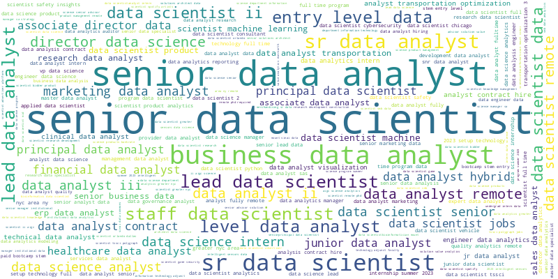
Image below is trigrams word cloud generated from this code:
trigrams_freqs = {}
for tg in trigram_fdist.items():
    trigrams_freqs[tg[0][0] + ' ' + tg[0][1] + ' ' + tg[0][2]] = tg[1]

from wordcloud import WordCloud

# Generate word cloud
wordcloud = WordCloud(width=800, height=400, background_color='white').generate_from_frequencies(trigrams_freqs)

# Visualize word cloud
plt.figure(figsize=(8, 5))
plt.imshow(wordcloud, interpolation='bilinear')
plt.axis('off')
plt.show()
Identify Seniority Level
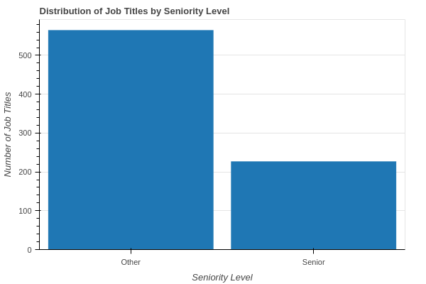
We are going to analyze the job titles to identify different levels of seniority (e.g., junior, senior, manager) and see if there are any trends or patterns. Since we don't have a seniority level column in our dataset, we need to define some rules and keywords to identify which titles are senior level.
After eyeballing the dataset, I defined these keywords: 'senior', 'lead', 'principal', 'vp', 'director', 'staff', 'manager'. You can add more keywords to the list. Next, we check each title and if any of these keywords would be in the title, we assume that job title is a Senior level job, Other otherwise.
# Define a function to identify seniority level based on keywords in the job title
def get_seniority_level(title):
    senior_keywords = ['senior', 'lead', 'principal', 'vp', 'director', 'staff', 'manager']
    for keyword in senior_keywords:
        if keyword in title.lower():
            return 'Senior'
    return 'Other'

# Apply the get_seniority_level function to the job title column and create a new seniority_level column
df['seniority_level'] = df['title'].apply(get_seniority_level)

# Group the data by seniority level and count the number of job titles in each group
grouped_df = df.groupby('seniority_level')['title'].count().reset_index(name='count')

# Create a Bokeh ColumnDataSource object for the bar chart
source = ColumnDataSource(grouped_df)

# Create the bar chart with Bokeh
p = figure(x_range=grouped_df['seniority_level'], height=400, width=600,
           title='Distribution of Job Titles by Seniority Level')

p.vbar(x='seniority_level', top='count', width=0.9, source=source)
p.xgrid.grid_line_color = None
p.y_range.start = 0
p.xaxis.axis_label = 'Seniority Level'
p.yaxis.axis_label = 'Number of Job Titles'

show(p)
We can see that almost 30% of the total job titles are senior level. One interesting observation would be to compare this across multiple years and see the trend, if we had data from previous years.
Topic modeling on Job Titles
Topic modeling is a natural language processing technique that can be used to identify topics or themes that are present in a large collection of text data. In the context of job titles, topic modeling can be used to identify the underlying topics or themes that are most common in data science job titles.
Here are the steps to perform topic modeling on job titles:
- Clean and pre-process the job titles data, removing stop words, punctuation, and other non-relevant information.
- Convert the preprocessed job titles data into a document-term matrix (DTM), which is a table that represents the frequency of each word in each job title.
- Use a topic modeling algorithm, such as Latent Dirichlet Allocation (LDA), to identify the underlying topics or themes in the job titles data. The algorithm will identify the most common word combinations or "topics" that are present in the data.
- Inspect the resulting topics to understand what they represent and give them meaningful labels. For example, a topic could be labeled "Machine Learning Engineer" if it includes words like "machine learning", "engineer", and "data".
- Assign each job title to one or more topics based on the words it contains.
- Analyze the distribution of topics across different job titles, companies, or other factors to identify patterns and trends in the data. By using topic modeling on job titles, you can gain insights into the most common themes and subtopics that are present in data science job titles, which can help you understand the skills and qualifications that are most in demand in the data science job market.
There are several libraries to do topic modeling including Gensim and BERTopic. For this post we are using Gensim.
We're using NLTK to clean and tokenize job titles. Then, we create a Gensim corpus, which is bag-of-words for titles. Then, we train an LDA model with different number of topics and choose the best one.
import numpy as np
import nltk
from nltk.corpus import stopwords
from nltk.stem import WordNetLemmatizer

from gensim.corpora import Dictionary
from gensim.models import LdaModel
from gensim.models.coherencemodel import CoherenceModel

nltk.download('stopwords')
nltk.download('wordnet')

stop_words = stopwords.words('english')
lemmatizer = WordNetLemmatizer()

def preprocess(text):
    tokens = nltk.word_tokenize(text.lower())
    tokens = [token for token in tokens if token not in stop_words and token.isalpha()]
    tokens = [lemmatizer.lemmatize(token) for token in tokens]
    return tokens

# Preprocess the job titles
df['title_tokens'] = df['title'].apply(preprocess)

# Create a dictionary from the job titles
dictionary = Dictionary(df['title_tokens'])

# Create a corpus from the dictionary and job titles
corpus = [dictionary.doc2bow(title_tokens) for title_tokens in df['title_tokens']]

# Train the LDA model
topics_range = [3,4,5,6,10]
n_topics = 0
cohs = []
for num_topics in topics_range:
    lda_model = LdaModel(corpus=corpus, id2word=dictionary, num_topics=num_topics, passes=10, iterations=400)

    cm = CoherenceModel(model=lda_model, texts=df['title_tokens'].values.tolist(), coherence='c_v')
    # cm = CoherenceModel(model=lda_model, corpus=corpus, coherence='u_mass')

    coherence = cm.get_coherence()
    cohs.append(coherence)
    print(f"Number of topics: {num_topics}, Coherence: {coherence}")

# Select the optimal number of topics
n_topics = topics_range[np.argmax(cohs)]
lda_model = LdaModel(corpus=corpus, id2word=dictionary, num_topics=n_topics, passes=10, iterations=500)
By Computing the topic coherence, we can find out which number of topics is optimal. The bigger the coherence, the better the model is.
Coherence: [0.5042733998871213, 0.4928157708829004, 0.5143670187831766, 0.5048272794509646, 0.47200016930420247]
5 is the best number of topics in my experiment. You may get different number of topics as it may change for different iterations.
Let's see the top-10 words for each topic:
# Print the top 10 words for each topic
for topic_id, topic_words in lda_model.show_topics(num_topics=n_topics, num_words=10, formatted=False):
    print(f"Topic {topic_id}: {[word[0] for word in topic_words]}")
Topic 0: ['data', 'analyst', 'remote', 'sr', 'clinical', 'iii', 'scientist', 'lead', 'developer', 'hybrid']
Topic 1: ['scientist', 'data', 'senior', 'analytics', 'level', 'staff', 'ii', 'entry', 'job', 'product']
Topic 2: ['data', 'analyst', 'specialist', 'science', 'intern', 'associate', 'analytics', 'senior', 'director', 'hybrid']
Topic 3: ['data', 'analyst', 'senior', 'analytics', 'business', 'manager', 'science', 'engineer', 'lead', 'health']
Topic 4: ['data', 'analysis', 'analyst', 'scientist', 'program', 'science', 'machine', 'learning', 'business', 'lead']
By looking at the top words of each topic we can manualy label the topics subjectively:
- Topic 0 label: data analyst
- Topic 1 label: data scientist
- Topic 2 label: entry level data analyst and analytics
- Topic 3 label: data analyst and busines analytics
- Topic 4 label: machine learning
We are going to see the distribution of job titles by topics.
# Get the topic distribution for each job title
df['topic_distribution'] = df['title_tokens'].apply(lambda x: lda_model[dictionary.doc2bow(x)])

# Identify the most important topic for each job title
df['topic'] = df['topic_distribution'].apply(lambda x: np.argmax(x,axis=0)[1])

# Group job titles by topic and count the number of titles in each group
topic_counts = df.groupby('topic')['title'].count()

# Create the bar chart
# Create a Bokeh data source with the topic counts
source = ColumnDataSource(data={
    'topics': [str(t) for t in topic_counts.index],
    'counts': topic_counts.values,
})

# Define the x-axis and y-axis ranges
x_range = FactorRange(factors=source.data['topics'])
y_range = (0, max(source.data['counts']) * 1.1)

# Create a figure object
p = figure(x_range=x_range, y_range=y_range, height=400, width=800, title='Distribution of Job Titles by Topic')

# Add a vertical bar chart to the figure
p.vbar(x='topics', top='counts', width=0.9, source=source, line_color='white', fill_color=Spectral5[0])

# Set visual properties for the figure
p.xgrid.grid_line_color = None
p.xaxis.axis_label = 'Topics'
p.yaxis.axis_label = 'Number of Job Titles'
p.yaxis.minor_tick_line_color = None
p.yaxis.major_tick_line_color = None


show(p)
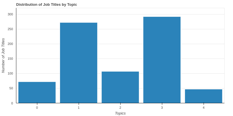
Image shows that topics of more than 50% of job titles either topic 1 or topic 3 which are data analyst and data scientist positions, respectively. Data analysts are even in higher demands according to our topics.
We can use lda_model.get_topics(), lda_model.get_topic_terms(), and lda_model.get_document_topics() to find topic distributions at word leve, get most important topic words and distribution of topics for each title. I use one of them to create a heatmap topic-title distributions and leave the rest as an exercise.
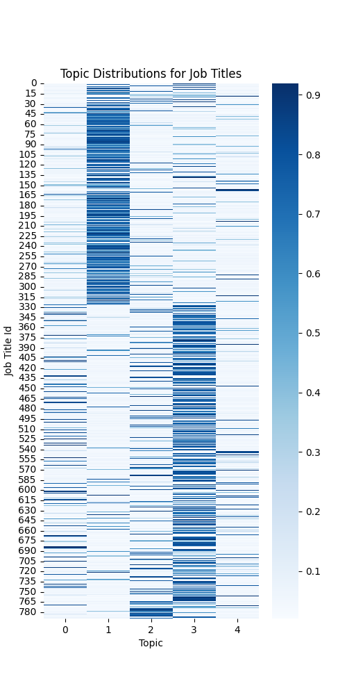
# create a heatmap of the topic distributions for each job title
import seaborn as sns
import numpy as np

topic_distributions = np.zeros((len(df), n_topics))
for i, doc in enumerate(corpus):
    for topic, prob in lda_model.get_document_topics(doc):
        topic_distributions[i][topic] = prob

plt.figure(figsize=(5, 10))
sns.heatmap(topic_distributions, cmap='Blues', cbar=True)
plt.xlabel('Topic')
plt.ylabel('Job Title Id')
plt.title('Topic Distributions for Job Titles')
plt.show()
The image below shows the topic-title distributions for all the titles. The daarker the color, the higher weight that topic has for a title.
There are several other interesting analyses that could be done. Following are just a few to name:
- Run BERTopic and compare the results with LDA
- Job description analysis: Extracting salary, skills, education and "years of experience" from job description and find if there is any pattern between job titles and descriptions. For example, for extrating "years of experience", you can write a regex, however, you need to do multiple iterations to make sure you got the right data. Here's a good start for you:
# Define the regex pattern to extract years of experience from the job description
exp_regex = r'(\d+)\+? year[s]? ?(?:of )?experience'

# Extract years of experience from the job description using the regex pattern
df['years_of_experience'] = df['description'].str.extract(exp_regex)
df['years_of_experience'] = df['years_of_experience'].fillna(0).astype(int)
We have done quite a bit of data analysis. Next step would be to pull some of these visualizations together and build a dashboard, so users can interact with the data. That's going to be next part of this tutorial.
You can find the Jupyter notebook code here.