
In the first part of this tutorial, we performed exploratory data analysis on our dataset using Python. We processed and cleaned the data, and created some insightful visualizations using Python libraries such as Pandas, Matplotlib, and Seaborn.
In this second part, we will take things to the next level by creating an interactive dashboard using React and D3. Our dashboard will consist of multiple linked visualizations, such as bar charts, heatmaps, and word clouds, that will allow users to explore and analyze the data in real-time.
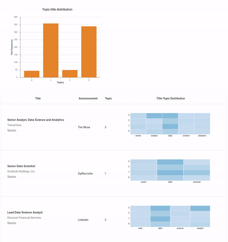
Finalized dashboard
We will start by creating a mockup of our dashboard, which will serve as a blueprint for our implementation. Then, we will dive into the code and create each visualization one by one, connecting them together to provide a seamless user experience. So, let's get started and build an interactive dashboard that will help us gain deeper insights into our data!
Creating a Mockup for the Dashboard: A Blueprint for Implementation
Before we start building our dashboard, it's essential to have a clear understanding of what we want to achieve. Creating a mockup or a blueprint can help us visualize the layout, design, and functionality of the dashboard, making it easier to implement.
To create a mockup for our dashboard, we can use various tools such as Adobe XD, Figma, Sketch, or even a pen and paper. In this tutorial, we will be using Excalidraw, a simple and easy-to-use online tool for creating diagrams, to design our mockup.
To get started, we can open Excalidraw in our browser and set the canvas size. This is the size we want our dashboard to be. We can then add various UI elements such as headers, titles, buttons, and input fields to create the basic layout of our dashboard. Next, we can start adding the visualizations to our mockup. For example, we can add a bar chart, a heatmap, and a word cloud to visualize different aspects of our data. As we add more elements to our mockup, we can adjust the layout, color scheme, and font sizes to make it look more appealing and user-friendly.
Once we are happy with the design, we can export the mockup as a PNG or a SVG file and use it as a reference during implementation.
Image below is my mockup:
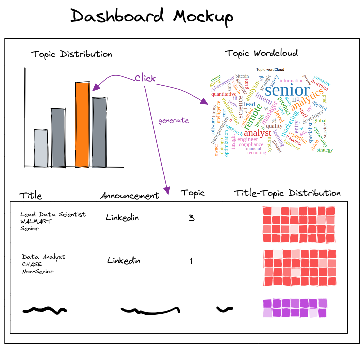
For this tutorial, I decided to divide the dashboard into two parts. The upper part consists of two sections. Top left is going to be a bar chart that shows the distribution of topics over job titles. It will be interactive, so user can hover over bars to see more information and also click on the bars. If user clicks on any bar, a word cloud will be generated on the right (top right). Word cloud will be the distribution of that topic over the vocabulary. Additionally, a table will be generated that contains all the jobs with their meta data like company, job description, etc for that clicked topic. This table will be on the lower part of the dashboard as can be seen in the image above. This table has four columns:
- Title: title of the job, hiring company, and the seniority of the job
- Announcement: which platform this job is advertised
- Topic: the dominant topic of this job title
- Title-topic distribution: the heatmap showing the distribution of each words over all the topics.
Creating a mockup for our dashboard can save us a lot of time and effort in the long run, as it can help us avoid unnecessary rework and ensure that we are building a dashboard that meets our requirements and expectations.
Creating a Backend API using FastAPI
If you remember in part one the tutorial, we performed topic modeling on job titles. Now to build an interactive dashboard, we need the topic model we trained before. Therefore, the best way is a backend API (for handling machine learning service) that can handle user requests and provide data to the frontend. In this tutorial, we will be using FastAPI, a modern web framework for building APIs with Python, to create our backend.
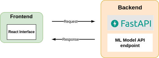
Backend API
The first step is to load the topic model that we trained in part 1 of the tutorial. We can use the Gensim library to load the model as part of the backend API and use it to answer various questions about the topics and documents in our dataset.
We can create a FastAPI app and define the endpoints that will respond to user requests. For example, if the user clicks on a particular bar of the bar chart, we can send a request to the backend for information about the clicked topic. To handle this request, we can define an endpoint that takes the topic ID as a parameter and returns a JSON object containing the top words and documents associated with that topic.
We can also define other endpoints to handle different types of requests, such as filtering the data based on certain criteria or searching for specific keywords in the documents. Once we have defined the endpoints, we can start the FastAPI app and test it using a tool like Postman or curl. We can then integrate the backend API with the frontend and use it to provide real-time data to the visualizations.
Creating a backend API using FastAPI can make it easier to handle user requests and provide data to the frontend. By loading the topic model we trained in part 1 of the tutorial, we can answer various questions about the topics and documents in our dataset and provide relevant information to the visualizations.
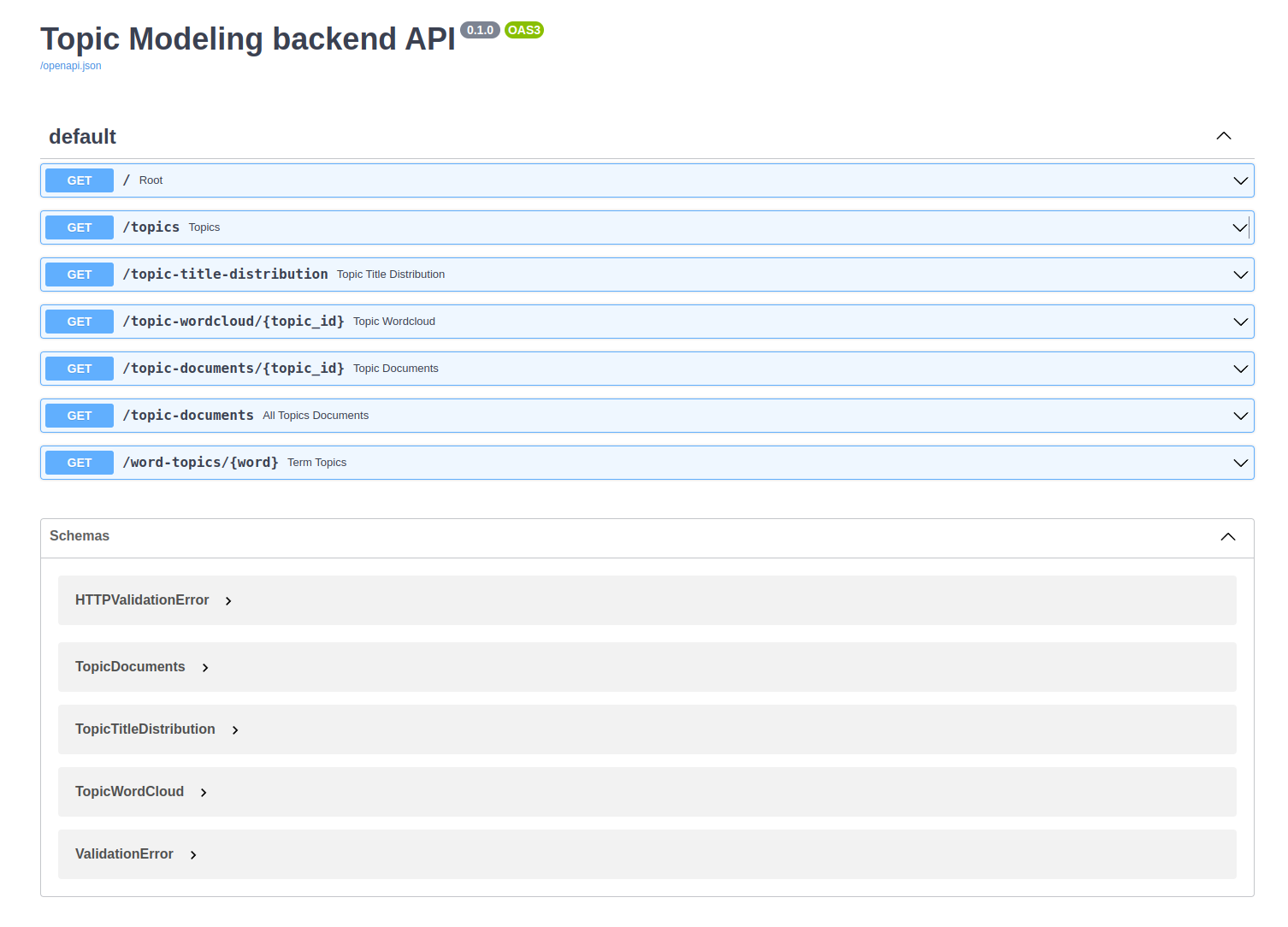
There are so many tutorials about how to create an app using FastAPI, so I'll skip that here. However, I will share all the code for the backend in the repo. In a nutshell, I have created several endpoints for handling different user request. The image below shows all the endpoints.
Show code for `main.py`
from fastapi import FastAPI
from fastapi.middleware.cors import CORSMiddleware
from pydantic import BaseModel
from fastapi import Request
import typing as t
import uvicorn
import json

from topic_modeling import TopicModeling

FILE_PATH = 'processed_df.csv'

app = FastAPI(
title="Topic Modeling backend API", docs_url="/docs"
)

origins = [
"http://localhost:8000",
"http://localhost:3000",
"http://127.0.0.1:8000",
"http://127.0.0.1:3000",
]

app.add_middleware(
CORSMiddleware,
allow_origins=origins,
allow_credentials=True,
allow_methods=["*"],
allow_headers=["*"],
)

topic_modeling = TopicModeling(FILE_PATH)

class TopicTitleDistribution(BaseModel):
topic: int
count: int

class TopicDocuments(BaseModel):
id: int
title: str
company: str
announcement: str
description: str
seniority_level: str
years_of_experience: int
topic: int
title_tokens: list[str]

class TopicWordCloud(BaseModel):
word: str
prob: float

@app.get("/")
async def root(request: Request):
return {"message": "Server is up and running!"}

@app.get("/topics")
async def topics(request: Request) -> t.List[int]:
return topic_modeling.get_topics()

@app.get("/topic-title-distribution")
async def topic_title_distribution(request: Request) -> t.List[TopicTitleDistribution]:
data = topic_modeling.get_topic_title_distibution()
return data

@app.get("/topic-wordcloud/{topic_id}")
async def topic_wordcloud(request: Request, topic_id:int) -> t.List[TopicWordCloud]:
return topic_modeling.get_topic_top_terms(topic_id)

@app.get("/topic-documents/{topic_id}")
async def topic_documents(request: Request, topic_id: int) -> t.List[TopicDocuments]:
topic_documsnts = topic_modeling.get_topic_documents(topic_id)
return topic_documsnts

@app.get("/topic-documents")
async def all_topics_documents(request: Request) -> t.List[TopicDocuments]:
topic_documsnts = topic_modeling.get_all_topics_documents()
return topic_documsnts

@app.get("/word-topics/{word}")
async def term_topics(request: Request, word: str):
return topic_modeling.get_term_topics(word)

if **name** == "**main**":
uvicorn.run("main:app", host="0.0.0.0", reload=True, port=8000)
Show code for `topic_modeling.py`
import pandas as pd
import numpy as np
import nltk
from nltk.stem import WordNetLemmatizer
from nltk.corpus import stopwords
from gensim.corpora import Dictionary
from gensim.models import LdaModel
from gensim.models.coherencemodel import CoherenceModel
import logging
import os


logging.basicConfig(format='%(asctime)s %(message)s', level=logging.INFO)
nltk.download('stopwords')
nltk.download('wordnet')

stop_words = stopwords.words('english')
lemmatizer = WordNetLemmatizer()


class TopicModeling:

    def __init__(self, filepath: str):
        try:
            self.df = pd.read_csv(filepath)
            logging.info(f"{filepath} file successfully loaded.")
        except Exception as e:
            logging.error(f"Error: {filepath} could not be loaded")

        # Preprocess the job titles
        self.df['title_tokens'] = self.df['title'].apply(self.preprocess)

        # Create a dictionary from the job titles
        self.dictionary = Dictionary(self.df['title_tokens'])

        # Get the list of topics
        self.topics = sorted(self.df.topic.unique().tolist())

        # Create a corpus from the dictionary and job titles
        self.corpus = [self.dictionary.doc2bow(title_tokens) for title_tokens in self.df['title_tokens']]

        # Load topic model from file
        self.lda_model = LdaModel.load('model/tm.model')

    def preprocess(self, text: str):
        tokens = nltk.word_tokenize(text.lower())
        tokens = [token for token in tokens if token not in stop_words and token.isalpha()]
        tokens = [lemmatizer.lemmatize(token) for token in tokens]
        return tokens


    def get_topics(self):
        return self.topics

    def get_topic_title_distibution(self):
        # Group job titles by topic and count the number of titles in each group
        topic_counts = self.df.groupby('topic')['title'].count()
        counts =  topic_counts.values.tolist()
        data = []
        for t in topic_counts.index:
            data.append({"topic": t, "count": counts[t]})
        return data


    def get_topic_documents(self, topic_id:int):
        data = self.df[self.df['topic'] == topic_id].to_dict(orient='record')
        results = []
        for row in data:
            results.append({"id": row["id"], "title": row["title"],
                            "company": row["company"], "announcement": row["announcement"],
                            "description": row["description"], "seniority_level": row["seniority_level"],
                            "years_of_experience": row["years_of_experience"], "topic": row["topic"],
                            "title_tokens": row["title_tokens"]})
        return results

    def get_all_topics_documents(self):
        data = self.df.to_dict(orient='record')
        results = []
        for row in data:
            results.append({"id": row["id"], "title": row["title"],
                            "company": row["company"], "announcement": row["announcement"],
                            "description": row["description"], "seniority_level": row["seniority_level"],
                            "years_of_experience": row["years_of_experience"], "topic": row["topic"],
                            "title_tokens": row["title_tokens"]})
        return results


    def get_term_topics(self, word: str):
        word_id = self.dictionary.token2id[word]
        results = self.lda_model.get_term_topics(word_id=word_id, minimum_probability=0)
        wtopics = []
        for topic,prob in results:
            wtopics.append({"topic": topic, "dist":round(float(prob), 5)})
        return wtopics


    def get_topic_top_terms(self, topic_id: int):
        results = self.lda_model.get_topic_terms(topicid=topic_id, topn=100)
        top_words = []
        for word_id,prob in results:
            top_words.append({"word": self.dictionary[word_id],
                              "prob": round(float(prob), 5)})
        return top_words
You can find the code here.
Creating the Dashboard using React and D3
Now that we have created the backend API, we can start building the interactive dashboard using React and D3.
Creating a Bar Chart
In this section, we will focus on creating a bar chart to display the distribution of titles over topics in our dataset. When the user clicks on a particular bar, we will generate a word cloud corresponding to the clicked topic and also create a table containing all the documents that have the clicked topic as their dominant topic.
First, we need to define our Dashboard React component.
const Dashboard = () => {
  return (
    <Grid container minHeight="100vh">
      <Grid item xs={6}>
        // Create bar chart
        <BarChart />
      </Grid>
      <Grid item xs={6}>
        // Create wordcloud
        <WordClould />
      </Grid>
      <Grid item xs={12} mt={2}>
        // Create a table for documents where dominant topics is clicked topic
        <TopicDocumentsTable />
      </Grid>
    </Grid>
  );
};
Now, we have to define each component. Let's begin with the BarChart.
const dimensions = {
  width: 500,
  height: 400,
  margin: { top: 30, right: 30, bottom: 60, left: 60 },
};

const BarChart = ({ onClick }) => {
  const { width, height, margin } = dimensions;
  const boundedDimensions = {
    width: width - margin.left - margin.right,
    height: height - margin.top - margin.bottom,
  };

  return (
    <div className="wrapper">
      <div>Topic-title distribution</div>
      <svg className="bar-svg" width={width} height={height}>
        <g transform={`translate(${margin.left},${margin.top})`}>
          // Code for Bar chart axes and bars will be here!
        </g>
      </svg>
    </div>
  );
};
When the dashboard is loaded, the bar chart will be displayed. Therefore, it needs to get the data from the backend API via a particular endpoint, and then draws the bars.
We create api.js as follows:
const serverUrl = 'http://localhost:8000';

const fetchData = async (endpoint) => {
  const response = await fetch(serverUrl + endpoint);
  if (!response.ok) {
    throw new Error('Could not connect to the server!');
  }
  const data = await response.json();
  return data;
};

export const getTopicTitleDistributions = (endpoint) => {
  return fetchData(endpoint);
};
Then in our BarChart component, we add:
useEffect(() => {
  getTopicTitleDistributions('/topic-title-distribution').then((res) =>
    setData(res)
  );
}, []);

if (!data) {
  return <div>Bar chart is being loaded...</div>;
}
While the BarChart is loaded/mounted, it will send a request to the backend via fetch API with /topic-title-distribution endpoint. The FastAPI will handle this endpoint, by getting a list of topics and title counts from topic model and then sends the response back to the frontend (i.e. barchart). Then BarChart will set the data property of its state to this new recieved data.
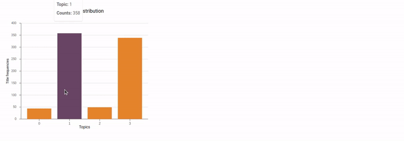
The format of the data is:
[
  {
    topic: 0,
    count: 44,
  },
  {
    topic: 1,
    count: 358,
  },
  {
    topic: 2,
    count: 49,
  },
  {
    topic: 3,
    count: 339,
  },
];
Since, we have the data, we need to create our scales and draw the bars, axes, labels, etc.
const barPadding = 0.2;
const xDomain = data.map((d) => d.topic);

// Define Scales
const xScale = d3
  .scaleBand()
  .domain(xDomain)
  .range([0, boundedDimensions.width])
  .padding(barPadding);

const yScale = d3
  .scaleLinear()
  .domain(d3.extent(data, (d) => d.count))
  .range([boundedDimensions.height, 0])
  .nice();
And we update the SVG component by adding:
<g transform={`translate(${margin.left},${margin.top})`}>
  <BarAxisBottom
    width={boundedDimensions.width}
    height={boundedDimensions.height}
    xScale={xScale}
  />
  <BarAxisLeft
    width={boundedDimensions.width}
    height={boundedDimensions.height}
    yScale={yScale}
  />
  <text
    x={boundedDimensions.width / 2}
    y={height - margin.bottom}
    textAnchor="middle"
    fontSize="12px"
  >
    Topics
  </text>
  <text
    transform={`translate(-40,${boundedDimensions.height / 2}) rotate(-90) `}
    style={{
      fontSize: '11px',
    }}
    textAnchor="middle"
  >
    Title frequencies
  </text>
  {data.map((d, i) => (
    <g key={i}>
      <rect
        x={xScale(d.topic)}
        y={yScale(d.count)}
        width={xScale.bandwidth()}
        height={boundedDimensions.height - yScale(d.count)}
        fill="#E6842A"
        className="bar"
      />
    </g>
  ))}
</g>
Note: I have used the some of the components that I had created for previous tutorials such as BarAxisBottom, BarAxisLeft, and even BarChart components. So if you have any doubts about how these components have been defined, please refer to my previous post.
The BarChart component is almost finished. We only need to add two things. First a tooltip to show useful information when user hovers over the bars, and also click function, so that when user clicks on a bar it will generate the word cloud for the clicked topic.
Again I am re-using tooltip code from older posts.
const {
  showTooltip,
  hideTooltip,
  tooltipLeft,
  tooltipTop,
  tooltipOpen,
  tooltipData,
} = useTooltip();

const handleMouseOver = (e, d) => {
  const x = xScale(d.topic);
  const y = yScale(d.count);
  showTooltip({
    tooltipLeft: x + xScale.bandwidth(),
    tooltipTop: y - margin.top - 50,
    tooltipData: d,
  });
};
And update the rect elements code:
{
  data.map((d, i) => (
    <g key={i}>
      <rect
        x={xScale(d.topic)}
        y={yScale(d.count)}
        width={xScale.bandwidth()}
        height={boundedDimensions.height - yScale(d.count)}
        fill="#E6842A"
        className="bar"
        onMouseOver={(e) => handleMouseOver(e, d)}
        onMouseOut={() => hideTooltip()}
      />
    </g>
  ));
}

// rest of the code
// </svg>
{
  tooltipOpen && (
    <Tooltip left={tooltipLeft} top={tooltipTop} className="bar-tooltip">
      <div>
        <div>
          <p style={{ textAlign: 'left' }}>
            <strong>Topic: </strong>
            {tooltipData.topic}
          </p>
          <p>
            <strong>Counts: </strong>
            {tooltipData.count}
          </p>
        </div>
      </div>
    </Tooltip>
  );
}
For hover feature as well as tooltip, I add these CSS properties to my styles.css file:
.bar-tooltip {
  transition: all 0.3s ease-out;
  font-size: 11px;
}

.bar:hover {
  fill: #684664;
}
The only remaining part is when the user clicks on a particular topic. To handle this event, instead of creating a handler function inside the BarChart, we'd rather want to create it in the Dashboard component. The reason is, because we will need the clicked topic for creating WordCloud and Table components, and these components are inside the Dashboard component. Therefore, it would be easier and makes more sense to create click handler function in the parent component of BarChart.
We add the following code to the Dashboard component:
const [topicId, setTopicId] = useState(-1);

const handleBarChartClick = (topId) => {
  setTopicId(topId);
};

// rest of the code

<Grid item xs={6}>
  <BarChart onClick={handleBarChartClick} />
</Grid>;
Inside the BarChart component:
<rect
  x={xScale(d.topic)}
  y={yScale(d.count)}
  width={xScale.bandwidth()}
  height={boundedDimensions.height - yScale(d.count)}
  fill="#E6842A"
  className="bar"
  onMouseOver={(e) => handleMouseOver(e, d)}
  onMouseOut={() => hideTooltip()}
  onClick={() => onClick(d.topic)}
/>
Here's the output:
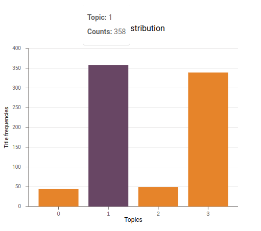
Barchart
Creating a WordCloud
To create a wordcloud, we need to have a list of words with some integer number for each word. Based on the how big or small the number is, the word will be displyed bigger or smaller in the wordcloud. In our case, for a topic we need to get top-n words for that topic along with some integer number, to be able to show the important words bigger.
However, we don't have the frequency of each word under each topic. One way is to calculate the frequencies. That said, we don't really need the actual frequences of words to create a wordcloud. Therefore, another option is, we already have the probability of each word for each topic, but the number is not an integer number. Can we somehow map these probability numbers into integers? In other words, we would like to change the range from to . The answer is yes, by multiplying them into fairly big integer number and truncate the decimal/fractional part. For example, if probability of a word under a topic is 0.73849, we can multiply it by let's say 1000 (= 738.49) and drop the fractinal part. Then we would have: 738.
What number to pick doesn't matter as long as it's big enough to distinguish important words in the wordcloud. We multiply all the probabilities to the same number. In this case, we will end up having a list of words with their integer numbers. If the probability of a word is higher than other words, it will automatically get a bigger integer number and will be displayed bigger in the word cloud.
To create the wordcloud, we first need to get the data for the clicked topic from the backend API. We update the Dashboard component by adding:
const wcDimension = { width: 600, height: 400 };
const margin = { top: 30, left: 30, bottom: 30, right: 30 };

const [topicWordCloud, setTopicWordCloud] = useState(null);

useEffect(() => {
  const fetchData = async () => {
    topWcloud = await getTopicWords(`/topic-wordcloud/${topicId}`);
    setTopicWordCloud(topWcloud);
  };
  fetchData();
}, [topicId]);

return (
  <Grid container minHeight="100vh">
    <Grid item xs={6}>
      <BarChart onClick={handleBarChartClick} />
    </Grid>
    <Grid item xs={6}>
      {topicWordCloud && (
        <WordClould
          width={wcDimension.width}
          height={wcDimension.height}
          margin={margin}
          data={topicWordCloud}
        />
      )}
    </Grid>
  </Grid>
);
We also add getTopicWords() function to our api.js file:
export const getTopicWords = (endpoint) => {
  return fetchData(endpoint);
};
Next, we create the WordCloud component:
import React, { useState, useEffect, useRef } from 'react';
import * as d3 from 'd3';
import WordCloud from 'react-d3-cloud';

import { Box, Typography } from '@mui/material';

const WordClould = ({ width, height, margin, data }) => {
  const words = data.map((d) => ({
    text: d.word,
    value: Math.ceil(d.prob * 1000) + 20,
    prob: d.prob,
  }));

  const schemeCategory10ScaleOrdinal = d3.scaleOrdinal(d3.schemeCategory10);

  return (
    <Box className="word-cloud">
      <Box>
        <Typography gutterBottom>Topic wordCloud</Typography>
      </Box>
      <WordCloud
        data={words}
        width={width - margin.left}
        height={height - margin.top}
        font="Impact"
        fontSize={(word) => Math.ceil(word.prob * 1000) + 20}
        spiral="rectangular"
        rotate={() => (~~(Math.random() * 6) - 3) * 30}
        padding={1}
        random={Math.random}
        fill={(_, i) => schemeCategory10ScaleOrdinal(i)}
        onWordClick={(event, d) => {
          console.log(`onWordClick: ${d.text}`);
        }}
        onWordMouseOver={(event, d) => {
          console.log(`onWordMouseOver: ${d.text}`);
        }}
        onWordMouseOut={(event, d) => {
          console.log(`onWordMouseOut: ${d.text}`);
        }}
      />
    </Box>
  );
};

export default WordClould;
Please note that I have used react-d3-cloud for creating wordcloud in React, so make sure to install this packege.
It's time to test it. We should see a wordcloud when we click on a bar.
Wordcloud generated when user clicks a bar
Awesome! Finally, we need to create a TopicDocumentsTable component showing all the job details from the dataset that have clicked topic as their dominant topic.
Creating a Table Component
There are so many packages for creating a table component in React. We are going to use Material UI table component.
Similar to previous section, we first need to get the data we want to display from the backend API. Therefore, we update Dashboard component. Please notice the highlighted code.
const Dashboard = () => {
  const wcDimension = { width: 600, height: 400 };
  const margin = { top: 30, left: 30, bottom: 30, right: 30 };

  const [topicId, setTopicId] = useState(-1);
  const [topicDocuments, setTopicDocuments] = useState(null);
  const [topicWordCloud, setTopicWordCloud] = useState(null);
  const [topics, setTopics] = useState(null);

  useEffect(() => {
    const fetchData = async () => {
      let topDocs;
      let topWcloud;
      if (topicId !== -1) {
        topDocs = await getTopicDocuments(`/topic-documents/${topicId}`);
        topWcloud = await getTopicWords(`/topic-wordcloud/${topicId}`);
      } else {
        topDocs = await getTopicDocuments(`/topic-documents`);
      }
      const allTopics = await getTopics('/topics');
      setTopicWordCloud(topWcloud);
      setTopicDocuments(topDocs);
      setTopics(allTopics);
    };
    fetchData();
  }, [topicId]);

  const handleBarChartClick = (topId) => {
    setTopicId(topId);
    if (topicId !== topId) {
      setTopicWordCloud(null);
      setTopicDocuments(null);
    }
  };

  return (
    <Grid container minHeight="100vh">
      <Grid item xs={6}>
        <BarChart onClick={handleBarChartClick} />
      </Grid>
      <Grid item xs={6}>
        {topicWordCloud && (
          <WordClould
            width={wcDimension.width}
            height={wcDimension.height}
            margin={margin}
            data={topicWordCloud}
          />
        )}
      </Grid>
      <Grid item xs={12} mt={2}>
        {topicDocuments ? (
          <TopicDocumentsTable
            topicDocuments={topicDocuments}
            topicId={topicId}
            topics={topics}
          />
        ) : (
          <div>Loading Table...</div>
        )}
      </Grid>
    </Grid>
  );
};
Let's create our TopicDocumentsTable component.
const columns = [
  { label: 'Title' },
  { label: 'Announcement' },
  { label: 'Topic' },
  { label: 'Title-Topic Distribution' },
];

const TopicDocumentsTable = ({ topicDocuments, topics }) => {
  const [page, setPage] = useState(0);
  const [rowsPerPage, setRowsPerPage] = useState(5);

  const handleChangePage = (event, newPage) => {
    setPage(newPage);
  };

  const handleChangeRowsPerPage = (event) => {
    setRowsPerPage(parseInt(event.target.value, 10));
    setPage(0);
  };

  return (
    <>
      <TableContainer component={Paper}>
        <Table sx={{ minWidth: 650 }}>
          <TableHead>
            <TableRow>
              {columns.map((col, i) => (
                <TableCell key={i} align="center">
                  {col.label}
                </TableCell>
              ))}
            </TableRow>
          </TableHead>
          <TableBody>
            {topicDocuments
              .slice(page * rowsPerPage, page * rowsPerPage + rowsPerPage)
              .map((row, index) => (
                <TableRow key={`row-${index}`}>
                  <CardTableCell
                    key={`cell-${Math.random()}`}
                    title={row.title}
                    company={row.company}
                    seniorityLevel={row.seniority_level}
                  />
                  <TableCell key={`cell-${Math.random()}`}>
                    {row.announcement}
                  </TableCell>
                  <TableCell key={`cell-${Math.random()}`}>
                    {row.topic}
                  </TableCell>
                  <TableCell key={`cell-${Math.random()}`}>
                    <DocumentTopicHeatmap
                      titleTokens={row.title_tokens}
                      topics={topics}
                    />
                  </TableCell>
                </TableRow>
              ))}
          </TableBody>
        </Table>
      </TableContainer>
      <TablePagination
        rowsPerPageOptions={[5, 10, 25]}
        component="div"
        count={topicDocuments.length}
        rowsPerPage={rowsPerPage}
        page={page}
        onPageChange={handleChangePage}
        onRowsPerPageChange={handleChangeRowsPerPage}
      />
    </>
  );
};

// Custom cell
const CardTableCell = ({ title, company, seniorityLevel }, ...restProps) => {
  return (
    <TableCell>
      <Card elevation={0}>
        <CardContent>
          <Typography
            variant="h6"
            sx={{ fontSize: 15 }}
            component="div"
            gutterBottom
          >
            {title}
          </Typography>
          <Typography sx={{ fontSize: 14 }} color="text.secondary" gutterBottom>
            {company}
          </Typography>
          <Typography sx={{ mb: 1.5 }} color="text.secondary">
            {seniorityLevel}
          </Typography>
        </CardContent>
      </Card>
    </TableCell>
  );
};
In this component, I have defined the columns that I would like to show in the table. I will only show "title" "company", "seniority level", "announcement", "topic", and "title-topic-distribution" columns to prevent cluttering the table. We could add "job description" "years of experience", etc. I have added "pagination" to show just a few records at the time. The rest is iterating over the data and create the rows of the table.
I have created two custom cells. First custom cell is a Material-UI Card that shows "title" "company", and "seniority level" all together. And the other custom cell is actually a "heatmap" that shows distribution of each word in the title over all the topics. I have created a separate component DocumentTopicHeatmap to create the heatmap. Creating a heatmap in React is very straightforward. We need the dimension of the plot, data, scales, and drawing the <rect> elements. We will use the probabilities to show the intensity of the <rect> elements. Adding tooltip is always a good idea.
const DocumentTopicHeatmap = ({ titleTokens, topics }) => {
  const { width, height, margin } = dimensions;
  const boundedDimensions = {
    width: width - margin.left - margin.right,
    height: height - margin.top - margin.bottom,
  };

  const [wordsTopicDistribution, setWordsTopicDistribution] = useState();
  const {
    showTooltip,
    hideTooltip,
    tooltipLeft,
    tooltipTop,
    tooltipOpen,
    tooltipData,
  } = useTooltip();

  useEffect(() => {
    const fetchData = async () => {
      const promises = titleTokens.map((word) =>
        getWordTopicDistribution(`/word-topics/${word}`)
      );

      const responses = await Promise.all(promises);
      const data = await Promise.all(responses.map((response) => response));
      setWordsTopicDistribution(data);
    };
    fetchData();
  }, [titleTokens]);

  if (!wordsTopicDistribution) {
    return;
  }
  const padding = 0.01;
  const xScale = d3
    .scaleBand()
    .domain(titleTokens)
    .range([0, boundedDimensions.width])
    .padding(padding);

  const yScale = d3
    .scaleBand()
    .domain(topics)
    .range([boundedDimensions.height, 0])
    .padding(padding);

  const colorScale = d3
    .scaleSequential()
    .domain([-0.3, 1])
    .interpolator(d3.interpolateBlues);

  const handleMouseEnter = (d, word) => {
    const x = xScale(word);
    const y = yScale(d.topic);
    showTooltip({
      tooltipLeft: x + xScale.bandwidth(),
      tooltipTop: y - margin.top - 40,
      tooltipData: d,
    });
  };
  return (
    <div className="wrapper">
      <svg className="bar-svg" width={width} height={height}>
        <g transform={`translate(${margin.left},${margin.top})`}>
          {wordsTopicDistribution.map((wtopic, i) =>
            wtopic.map((d, j) => (
              <rect
                className="heatmap-rect"
                key={`rect-${i}-${j}`}
                x={xScale(titleTokens[i])}
                y={yScale(d.topic)}
                width={xScale.bandwidth()}
                height={yScale.bandwidth()}
                fill={colorScale(d.dist)}
                onMouseEnter={() => handleMouseEnter(d, titleTokens[i])}
                onMouseLeave={() => hideTooltip()}
              />
            ))
          )}
          {/* X Axis */}
          {titleTokens.map((tick, i) => (
            <text
              key={i}
              x={xScale(tick)}
              dy="1em"
              transform={`translate(${xScale.bandwidth() / 2}, ${
                boundedDimensions.height
              })`}
              textAnchor="middle"
              style={{ fontSize: '10px' }}
            >
              {tick}
            </text>
          ))}

          {/* Y Axis */}
          {topics.map((tick, i) => (
            <text
              key={i}
              dx="-.71em"
              y={yScale(tick)}
              transform={`translate(0, ${yScale.bandwidth() / 2}
                )`}
              textAnchor="middle"
              style={{ fontSize: '10px' }}
            >
              {tick}
            </text>
          ))}
        </g>
      </svg>
      {tooltipOpen && (
        <Tooltip
          left={tooltipLeft}
          top={tooltipTop}
          className="heatmap-tooltip"
        >
          <div>
            <div>
              <p style={{ textAlign: 'left' }}>
                <strong>Topic: </strong>
                {tooltipData.topic}
              </p>
              <p>
                <strong>Probability: </strong>
                {tooltipData.dist}
              </p>
            </div>
          </div>
        </Tooltip>
      )}
    </div>
  );
};
Here's the final dashboard.
Final dashboard
There are several other features that could be added to our dashboard such as:
- Showing the job titles having a specific word by clicking a word in the wordcloud
- Showing a clustering visualization of the dataset according to the topics.
- Showing visualizations that involve job descriptions
- etc.
You can find all the code for the backend and frontend at this Git repo.