
Data visualization is an important aspect of making sense of large amounts of data. It allows us to quickly identify patterns and trends, and make informed decisions based on that information. React and D3.js are two powerful tools that can be used together to create powerful and interactive data visualizations.
In this blog post, we'll explore how to use React and D3.js to create data visualizations, and how they can be used together to create dynamic and interactive visualizations.
First, let's take a look at D3.js. D3.js, which stands for Data-Driven Documents, is a JavaScript library that allows you to create data-driven documents, such as charts and graphs, using HTML, CSS, and SVG. It has a wide range of built-in functions and tools that can be used to create a wide range of different types of visualizations.
React, on the other hand, is a JavaScript library for building user interfaces. It allows you to create reusable components that can be easily integrated into your application. React's virtual DOM (Document Object Model) makes it easy to update and render changes to the UI, which is important when working with dynamic data.
Combining React and D3.js could be notoriously tricky, since they both want to handle the DOM. Nevertheless, if done properly, it allows us to take advantage of the strengths of both libraries. while D3.js can handle the creation and manipulation of the visualizations themselves, we'd rather use it for data manipulation and let React handle the application's state, visualization, and user interactions. This separation of concerns allows for a more maintainable and scalable codebase.
Set up a React project
When creating a data visualization with React and D3.js, the first step is to set up a React project. You can use the create-react-app command to set up a new project, and then install D3.js using npm.
npx create-react-app my-app
This will create a new directory called "my-app" that contains a basic React project. Once you have your React project set up, the next step is to install D3.js. You can do this by running the following command in your project directory:
npm install d3
Once your project is set up, you can start creating your visualization. Here are the general steps for creating a visualization using D3.js:
Collect and prepare your data: Before creating the visualization, you'll need to have your data ready. This means cleaning, formatting, and organizing the data as needed.
Set up the SVG container: D3.js uses SVG (Scalable Vector Graphics) to create visualizations. This means that you'll need to create an SVG element in your HTML and set its size and dimensions.
Create scales: D3.js uses scales to map data values to visual elements. You'll need to create a scale for each dimension of your data. For example, if you're creating a line chart, you'll need to create a scale for the x-axis and a scale for the y-axis.
Create the visualization: Once you have your data, container, and scales set up, you can start creating the visualization itself. This can involve creating the elements that make up the visualization (e.g. lines, bars, circles) and binding the data to those elements.
Add axis, labels and legends: Adding axis, labels and legends help to understand the data better and make it clear what the visualization represents.
Add interactivity: D3.js allows you to add interactivity to your visualizations, such as hover effects and animations. You can use D3's built-in functions and events to add interactivity to your visualization. We, however, use React for interactions.
Test and refine: Once you have your visualization set up, you'll want to test it and make any necessary adjustments. This can involve adjusting the scales, tweaking the visual elements, and adding or removing interactivity as needed.
We leave the interactivity to a separate blog post.
Set up line chart with React
In your project directory, create a new file called LineChart.js and add the following code:
import React, { useRef, useEffect } from 'react';
import * as d3 from 'd3';

const dimensions = {
  width: 600,
  height: 400,
  margin: { top: 30, right: 30, bottom: 40, left: 50 },
};

const LineChart = ({ data }) => {
  const boundedDimensions = {
    width: dimensions.width - margin.left - margin.right,
    height: dimensions.height - margin.top - margin.bottom,
  };

  // 1. Access the data

  // 2. Create scales

  // 3. Draw visualization

  // 4. Draw axis, labels, legends, etc

  return <svg width={dimensions.width} height={dimensions.height}></svg>;
};
Inside our component we need to create a SVG element to be able to visualize the data in the browser. Therefore, we define our SVG element and set the width and height of it.
Collect and prepare the data
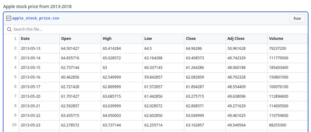
The dataset that I'll be using contains Apple stock prices from 2013 to 2018 that I got from Observable. In order to easily work with the data, I created a Github Gist and uploaded csv file. Below is a screenshot of the data columns and values.
We'll be using the Date and Close cloumns for our line chart. There are several ways to read and load the dataset. We are going to utilize d3.csv() built-in function. It's simply a convenient method on top of Fetch API. For more information please see its documentation here.
d3.csv(url[([, accessor], callback)]);
To make the code more modularized, I have defined a custom hook that loads the dataset in the App.js file and passes it to LineChart component.
import React, { useEffect, useState } from 'react';
import { csv } from 'd3';
const useData = () => {
  const [data, setData] = useState();
  useEffect(() => {
    csv(
      'https://gist.githubusercontent.com/mallahyari/8d4f6a43c80154bdb391edbc3f156029/raw/26792b80dbabdd6371bc9ff10c17f9a090495649/apple_stock_price.csv'
    ).then((dataset) => setData(dataset));
  }, []);

  return data;
};

export default useData;
Set up SVG container
When drawing a chart, we need two containers. First one is the main SVG that holds the entire chart, axes, data elements, labels, etc. We call this container, the wrapper. The second one (inner container) that contains our data elements and we call it bounding box. We, then, need to define dimensions for both containers.
Image below illustrates the wrapper SVG and bounding box containers.
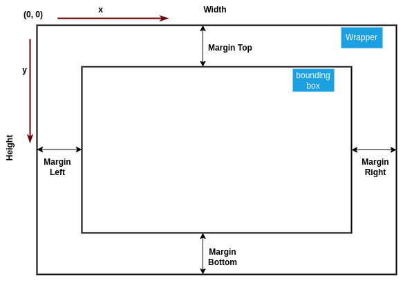
Chart dimensions
We define a dimension object that contains the size of the wrapper and all the margins. The margins give room for axes, ticks, labels, annotation, etc.
<svg width={width} height={height} style={{ border: '1px solid black' }}>
  <g transform={`translate(${margin.left},${margin.top})`}></g>
</svg>
The <g> element is our bounding box that contains and groups data elements visualizations. We need to shift bounding box to respect our top and left margins, to make sure that our chart is inside our SVG element. The CSS transform property allows the <g> element to shift its content all at once.
const dimensions = {
  width: 800,
  height: 400,
  margin: { top: 30, right: 30, bottom: 40, left: 60 },
};
Define data accessors
When the data is available in our LineChart component, we need to access the metrics (i.e. columns) that we want to visualize.
// Define accessors
const dateParser = d3.timeParse('%Y-%m-%d');
const xAccessor = (d) => dateParser(d.Date);
const yAccessor = (d) => +d.Close;
Both the Date and Close columns are string, and also, I used d3.timeParse to parse the string and convert it to Javascript date object. You can check the documentation here.
Create the scales
In D3.js, a scale is a function that maps data values to visual elements, such as pixels on a screen. Scales are used to translate the data into the coordinate system that is used by the SVG elements that make up the visualization. D3.js provides several types of scales, including linear scales, time scales, and ordinal scales, and a few more. Each type of scale is designed to work with a specific type of data. For example, a linear scale can be used to map numerical data to a continuous range of values, such as pixels on a screen, while an ordinal scale can be used to map categorical data to a discrete range of values, such as colors. You can check this link out to play with different scales in d3.
Linear scale is one of the most common scales used in D3.js, it allows to map a continuous domain of data [min, max] to a continuous range of pixels [0, width]. For example, in a line chart, a linear scale can be used to map the x-axis data to the horizontal position of the line on the SVG, and the y-axis data to the vertical position of the line.
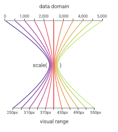
How scales map values Image source
We need to create two scales: (i) a scale for x-axis to map date values of our dataset into the range of [0, width] of our bounding box; (ii) a scale that converts stock closing price into the range of [0, height].
// Define Scales
const xScale = d3
  .scaleTime()
  .domain(d3.extent(data, xAccessor))
  .range([0, boundedDimensions.width])
  .nice();

const yScale = d3
  .scaleLinear()
  .domain(d3.extent(data, yAccessor))
  .range([boundedDimensions.height, 0])
  .nice();
The reason that yScale's range is [height, 0] is that SVG y-values start from top to bottom so we want our range to begin at the top. Additionally, we used d3.extent() function from d3-array to find the minimum and maximum values for date and close columns.
Draw the line
Now that we have defined our scales, we can draw the line and see the result. Thankfully, d3 save us again by providing us the tools and functions to create the line. We rely on d3-shape to map our data to a line.
// Define line generator
const lineGenerator = d3
  .line()
  .x((d) => xScale(xAccessor(d)))
  .y((d) => yScale(yAccessor(d)));
The line visualization is essentially a SVG path element that takes a d attribute to create a shape. Using d3.line() function generates the d string for us, which we can use in our path element.
<path
  d={lineGenerator(data)}
  className="line-chart"
  fill="none"
  stroke="#E3BA22"
  strokeWidth="2"
/>
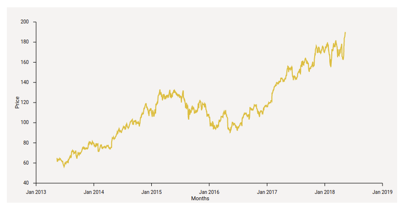
Here's our line chart:
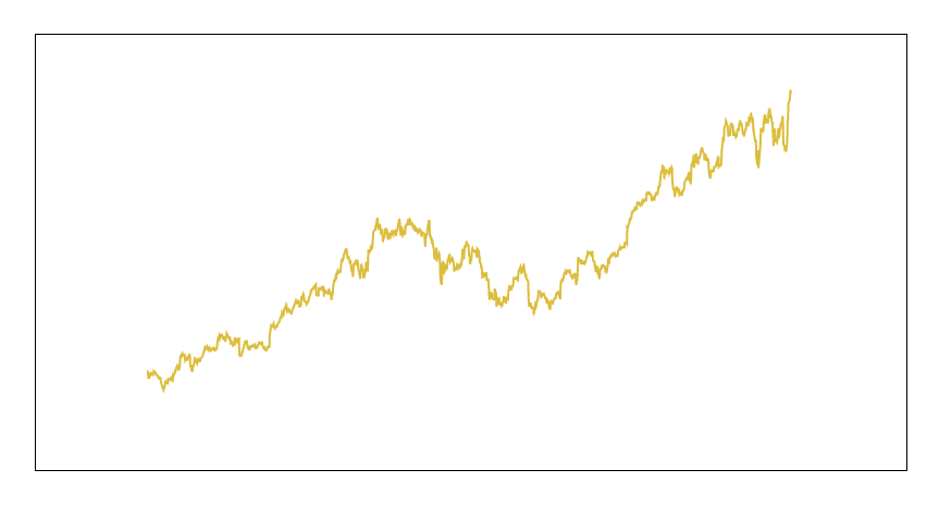
Cool! the line's drawn properly, however, there is no axis to help us understand the chart. Let's create axes for our line.
Draw the axes
We can use d3.axisBottom() and d3.axisLeft() functions from d3 API to create x and y axis respectively. Nevertheless, our goal is to create axes in React. So we have to write custom code to create the axis, ticks, and their format.
Our axis needs:
- A line that starts from 0 to width (for x axis) or height (y axis) of our chart.
- All the ticks with the labels
Our scale's tick([count]) method returns approximately count representative values from the scale’s domain. If count is not specified, it defaults to 10. The specified count is only a hint; the scale may return more or fewer values depending on the domain. Our xScale.ticks() method return 7 ticks:

Since our tick values are dates, we can use d3.timeFormat() with a proper format to display the ticks on the axis. I used d3.timeFormat(%b %Y) to show only the month and year for ticks. You can see d3-time-format for complete formats information. Let's put together everything and create the React component for x axis:
const AxisBottom = ({ width, height, xScale }) => {
  return (
    <g className="axis xaxis" transform={`translate(0, ${height})`}>
      <line x1={0} x2={width} stroke="currentColor" />

      {xScale.ticks().map((tickvalue, i) => (
        <g key={i} transform={`translate(${xScale(tickvalue)},0)`}>
          <line y2={6} stroke="currentColor" />
          <text
            // y="15"
            dy=".71em"
            fill="currentColor"
            style={{
              fontSize: '10px',
              textAnchor: 'middle',
              transform: 'translateY(15px)',
            }}
          >
            {timeFormat('%b %Y')(tickvalue)}
          </text>
        </g>
      ))}
    </g>
  );
};
Several points worth mentioning here. We grouped the entire axis into a <g> element so we can easily shift it because our (0,0) point is at top left. So we must move the x axis to the bottom. Then, we iterate on each tick value and create a tick line and a text label for it. To better organize ticks we put each tick into a separate <g> element too. And lastly, we can use y value or CSS transform to shift the text labels below the ticks for better readability.
Similarly, for y axis we'll have:
const AxisLeft = ({ height, yScale }) => {
  return (
    <g className="axis yaxis">
      <line x1={0} y2={height} stroke="currentColor" />

      {yScale.ticks().map((tickvalue, i) => (
        <g key={i} transform={`translate(0,${yScale(tickvalue)})`}>
          <line x2={-6} stroke="currentColor" />
          <text
            // x={-15}
            dy={'.32em'}
            fill="currentColor"
            style={{
              fontSize: '10px',
              textAnchor: 'end',
              transform: 'translateX(-15px)',
            }}
          >
            {tickvalue}
          </text>
        </g>
      ))}
    </g>
  );
};
We also define labels for our axes. The x axis label should be in the middle of the axis line (i.e. width/2) a bit further below tick values. Similarly, the y axis label should be in the middle (i.e. height/2), further to the left of the axis and needs to be rotated.
{/* X axis label */}
<text
  x={boundedDimensions.width / 2}
  y={35}
  className="axis-label"
  transform={`translate(0, ${boundedDimensions.height})`}
  style={{
    fontSize: '11px',
    textAnchor: 'end',
  }}
>
  {xAxisLabel}

{/* Y axis label */}
<text
  textAnchor="middle"
  className="axis-label"
  transform={`translate(-35,${
    boundedDimensions.height / 2
  }) rotate(-90) `}
  style={{
    fontSize: '11px',
  }}
>
  {yAxisLabel}
</text>
Not to mention that I added some CSS properties to the line and text elements to make them more apealing to the eyes.
Here's the final result:
You can find the code at this Github repo.