
Radar plots, also known as spider plots or star plots, are a great way to visualize multivariate data. They are particularly useful when you want to compare multiple variables for a set of items. Here are some situations where radar plots may be useful:
Comparing multiple variables: Radar plots are useful for showing how multiple variables are related to each other. They allow you to see the relative strengths and weaknesses of each variable across a set of items.
Showing relative values: Radar plots can be useful for showing the relative values of each variable for a set of items. This can be useful for comparing the relative strengths and weaknesses of different items.
Displaying data with cyclical patterns: If your data has cyclical patterns, such as seasonal patterns, a radar plot can help you visualize it by plotting the variables on a circular axis.
Radar plots tend to be among my favorite types of plots as they can convey various kinds of information simultaneously, and are also visually appealing. In this blog post, I will show you how to create a radar plot using React and D3.js. Like previous blogs, our goal is to use React for managing the DOM and utilize d3 for data manipulations.
There are many libraries that allow you to draw radar plots like Plotly, but when it comes to creating beautiful plots, they are limited and don't have a lot of flexibility. That make sense, because their intention is more towards non-technical individuals.
Plots do not have to be necessarily visually appealing, but it is generally beneficial for them to be clear and easy to understand. A well-designed plot can help make the data more accessible and easier to interpret. This can be especially important when presenting data to non-experts or decision-makers who may not have the same level of expertise in the subject matter.
Visual appeal can be achieved by using colors, labels, and other design elements to guide the viewer's eye through the data. This can help convey the main message of the plot more effectively. It is also important to choose the right type of plot for the data and the message you want to convey.
I covered in the visualizing line chart that for creating any plot we need to follow six main steps:
- Prepare the data
- Create the SVG element
- Create the scales
- Draw the (radar) plot
- Add interactivity
- Add styling
Now let's complete each step.
Prepare the data
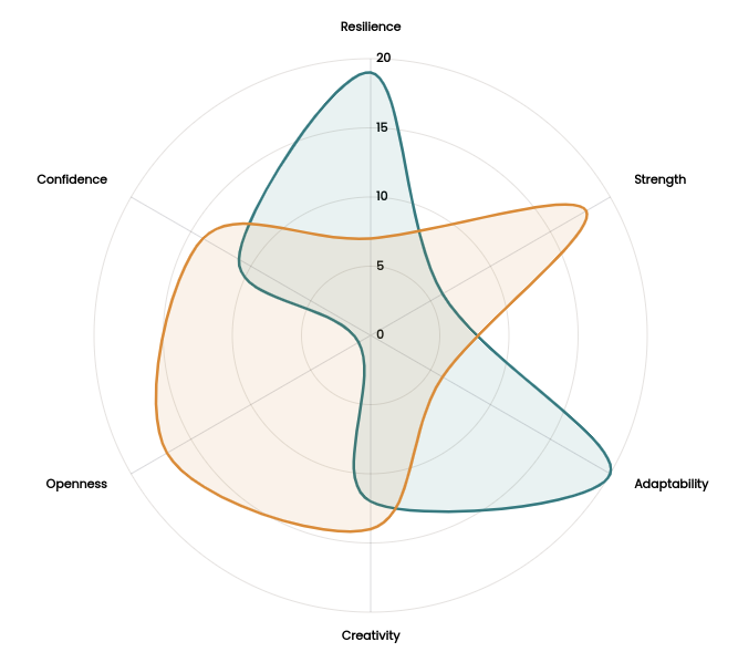
Before we are able to proceed, we need to prepare our dataset. For this example I have created some fake data. My data represents levels of skills for two persons.
const initialData = [
  [
    { key: 'resilience', value: 19 },
    { key: 'strength', value: 6 },
    { key: 'adaptability', value: 20 },
    { key: 'creativity', value: 12 },
    { key: 'openness', value: 1 },
    { key: 'confidence', value: 11 },
  ],
  [
    { key: 'resilience', value: 7 },
    { key: 'strength', value: 18 },
    { key: 'adaptability', value: 6 },
    { key: 'creativity', value: 14 },
    { key: 'openness', value: 17 },
    { key: 'confidence', value: 14 },
  ],
];
Create the SVG element
I create a file called SimpleRadar.js as my React component, and add an SVG element that will be used to render the radar plot. We need to define dimensions of our SVG.
const dimensions = {
  width: 600,
  height: 600,
  margin: { top: 50, right: 60, bottom: 50, left: 60 },
};

const SimpleRadar = ({ data = initialData }) => {
  const { width, height, margin } = dimensions;

  // bounding box dimensions
  const boundedDimensions = {
    width: dimensions.width - margin.left - margin.right,
    height: dimensions.height - margin.top - margin.bottom,
  };

  boundedDimensions.radius = boundedDimensions.width / 2;

  return (
    <div>
      <svg width={width} height={height}></svg>
    </div>
  );
};
We would like our radar plot to be in the center of the SVG, therefore, we'd set our SVG width and height to be equal. The bounding box that we create inside SVG, which basically contain all the data visualization elements must respect our SVG margins, to make sure the entire chart will displayed properly. Thus, we shift our bounding box so that (0, 0) point will be top-left of the bounding box. The figure below depicts the transformation.
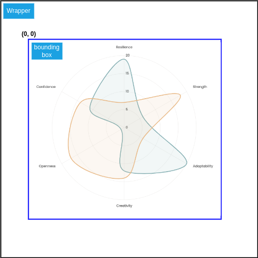
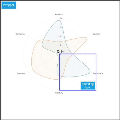
However, we will have some difficulties. Our radar chart is expected to be inside the bounding box, to be in the center of it to be exact. Therefore, selecting top-left of the bounding box as our (0, 0) point makes our math and all the calculations that we need to do for drawing circles, ticks, axes, etc., more difficult. Because all the drawings will be in respect to this point. To make our math much easier later on, we shift our bounding box in such a way that the point (0, 0) will shift to the center of the SVG. Now, we can place our visualization elements easily with respect to the center of radar plot circle.
// bounding box
<g
  transform={`translate(${margin.left + boundedDimensions.radius} ,${
    margin.top + boundedDimensions.radius
  } )`}
></g>
Define the scales
As our data shows, we have six skills (variables) that need to displayed on the radar chart. So, we need a continuous scale with a domain of [0,5].
Radar plot is circular, therefore, our scale's range must be [0, 2 * Math.PI].
// This creates an array of [0, 1, 2, 3, 4, 5]
const angleScaleDomain = d3.range(data[0].length + 1);

// Accessor method to access `key` names from data
const angleScaleDomainLabels = data[0].map((d) => d.key);

const angleScale = d3
  .scaleLinear()
  .domain(d3.extent(angleScaleDomain))
  .range([0, 2 * Math.PI]);
Please note that we are using radians as javascript Math library has functions like math.sin() and Math.cos() that work with radians.
We can use our scale to find where to put six skills' labels (['resilience', 'strength', 'adaptability', 'creativity', 'openness', 'confidence']) on the radar plot around the circle. Given our angleScale, we pass a number between 0 and 5 and it gives us the angle to place our label. Nevertheless, we need one more thing. We should be able to find a [x, y] position on the plot by giving an angle. How to do that? Answer is simple, we make use of our trigonometry knowledge.
Given an angle , we can calculate the [x, y] using the following formulas:
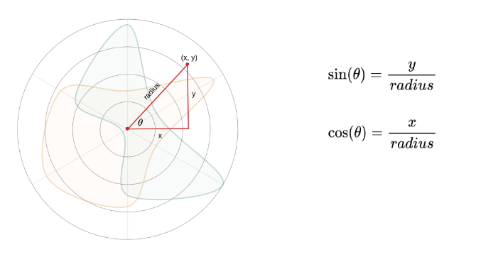
Therefore we have:
, and
In order to draw elements at arbitrary radii (e.g. tick values or skill labels), we add another variable offset to our function. Additionally, we rotate angles by -90 degrees or -Math.PI/2 so the angle 0 begins at 12 O'clock.
const getCoordinatesForAngle = (angle, offset = 1) => {
  return [
    boundedDimensions.radius * Math.cos(angle - Math.PI / 2) * offset,
    boundedDimensions.radius * Math.sin(angle - Math.PI / 2) * offset,
  ];
};
We need another scale that I call it radiusScale, for our value field in our dataset, as each record in our dataset has skill and value attributes. Domain of radiusScale has to be [min, max] of value feature, and the range is the range will be [0, radius].
let allVals = [];
data.map((array) => array.map((d) => allVals.push(d.value)));

const radiusScale = d3
  .scaleLinear()
  .domain([0, d3.max(allVals)])
  .range([0, boundedDimensions.radius])
  .nice();
We can use radiusScale to get ticks for our radar plot.
const valueTicks = radiusScale.ticks(4);
Draw the radar plot
Now that we have defined our scales, we only need to create a line generator to draw lines on the radar chart. We utilize d3.lineRadial() function, please see documentation here. It's very similar to d3.line() except it accepts angle() and radius() methods.
const radarLineGenerator = d3
  .lineRadial()
  .angle((d, i) => angleScale(i))
  .radius((d) => radiusScale(d.value))
  .curve(d3.curveCardinalClosed);
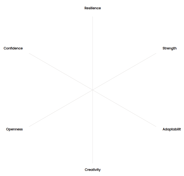
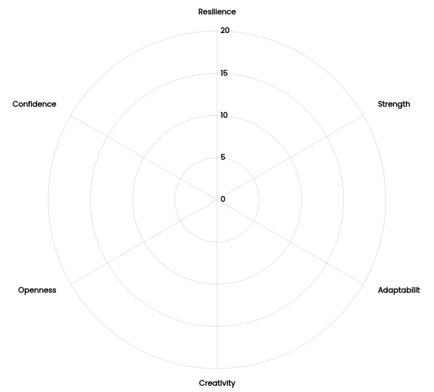
We are ready to create our radar plot. We start by drawing grid lines for our skills as well as skills' labels. We have our labels, therefore, we simply iterate over each one and get its angle, then find [x, y] using our getCoordinatesForAngle() and draw <line> from the center of the circle. For drawing the labels, we would like them to be a little bit outside of the radar plot circle, therefore, we set our offset to be slightly bigger than 1. Here's the code:
{
  angleScaleDomainLabels.map((label, i) => {
    const angle = angleScale(i);
    const [x, y] = getCoordinatesForAngle(angle);
    const [labelX, labelY] = getCoordinatesForAngle(angle, 1.1);
    return (
      <g key={i} className="grid">
        <line x2={x} y2={y} stroke="#E5E2E0" className="grid-line" />
        <text
          x={labelX}
          y={labelY}
          textAnchor={labelX < 0 ? 'end' : labelX < 3 ? 'middle' : 'start'}
        >
          {label}
        </text>
      </g>
    );
  });
}
The figure below shows the output:
We need to draw the ticks. For each tick value, we draw a <circle> with r=radiusScale(tick) and for tick label we create a <text> element and set x and y positions. I set the x value to be slightly to the right and y values be vertically drawn.
{
  valueTicks.reverse().map((tick, i) => (
    <g key={i} className="grid">
      <circle
        // style={{ filter: 'url(#dropshadow)' }}
        r={radiusScale(tick)}
        fill="#fff"
        // fill="#E5E2E0"
        stroke="#E5E2E0"
        fillOpacity={0.9}
      />
      <text x={5} y={-radiusScale(tick)} dy=".3em">
        {tick}
      </text>
    </g>
  ));
}
 To finish our drawing, we need to draw the lines using our
 lineGenerator. We have two series of records for two people, so we will draw two path elements.
<g>
   <path
     d={radarLineGenerator(data[0])}
     fill="#137B80"
     stroke="#137B80"
     strokeWidth="2.5"
     fillOpacity="0.1"
   />
 </g>
 <g>
   <path
     d={radarLineGenerator(data[1])}
     fill="#E6842A"
     stroke="#E6842A"
     strokeWidth="2.5"
     fillOpacity="0.1"
   />
 </g>
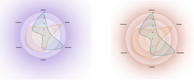
You can see the radar plot in the image below.
It looks nice already! Nevertheless, Let's add more styling to that. I would like to add some shadow to my plot and each inner circle. To be able to do that, we cannot use CSS box-shadow, because it gives us a rectangular shadow, so it's not good for non-rectangular shapes. Instead, we will use the CSS filter property with drop-shadow. Another way is to define a SVG filter to have lots of flexibility to control the shadow and opacity to give to drop-shadow. For this example, I'll go with the former option. I created a CSS file styles.css and added the following CSS rules:
grid circle {
  filter: drop-shadow(0px 5px 100px rgba(146, 212, 238, 0.9));
  mix-blend-mode: multiply;
}
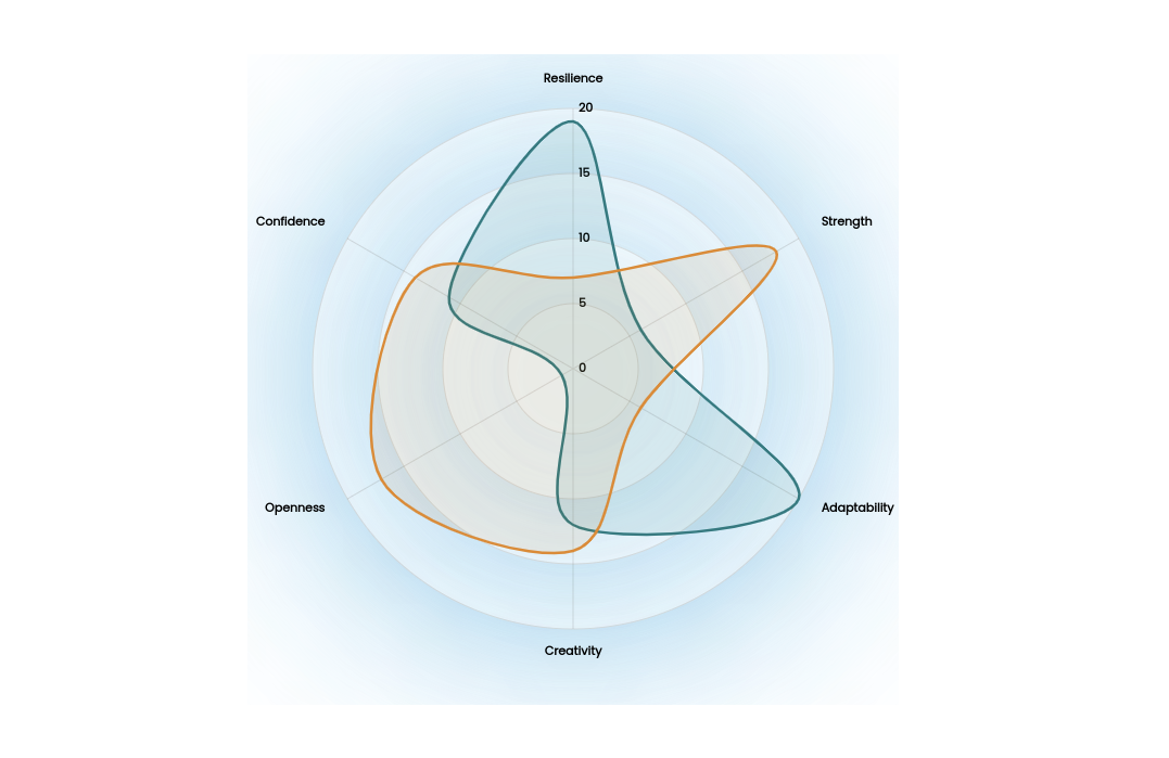
The plot looks quite beautiful. However, you can see a rectangle around it that has clipped the shade of the blue color. It can be easily fixed by adding an overflow: 'visible' property to the SVG element.
<svg
  width={width}
  height={height}
  style={{ backgroundColor: '#fff', overflow: 'visible' }}
>
  // rest of the code
</svg>
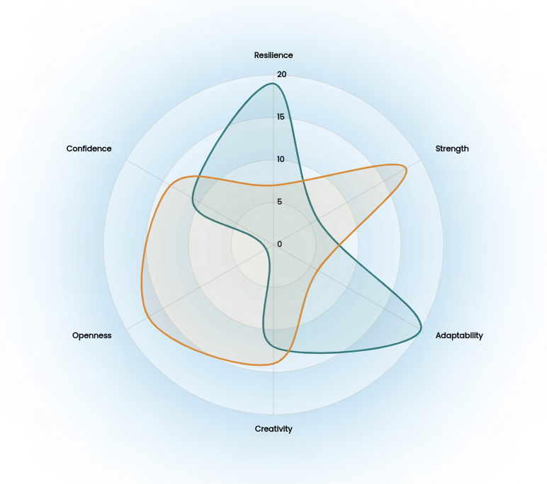
By changing the drop-shadow values, you'll get very pretty plots.
You can find the code here at Github repo