
Data visualization is a powerful tool that enables us to extract insights from large datasets, understand complex relationships between variables, and communicate results in a clear and compelling way. One particularly useful type of visualization for exploring data distributions is the ridge plot, which displays the density of data along a single axis.
Ridge plots are particularly helpful for identifying differences in distributions between multiple groups or variables. In this blog post, we'll explore how to create an interactive ridge plot using React and D3, two popular libraries for building web-based data visualizations. The inspiration for this work comes from an article by UK Office of National Statistics. The ridge plot in that article was really captivating and interestingly, they had shared the dataset in the article. Therefore, I decided to write a blog post about ridge plots and use the same dataset. :)
We'll start with an overview of what ridge plots are and why they're useful, then dive into the technical details of building an interactive ridge plot using React and D3. Along the way, we'll discuss different use cases for interactive ridge plots and the benefits they can offer for data analysis and decision-making. By the end of this post, you'll have a solid understanding of how to create an interactive ridge plot and how to apply it to your own data analysis projects.
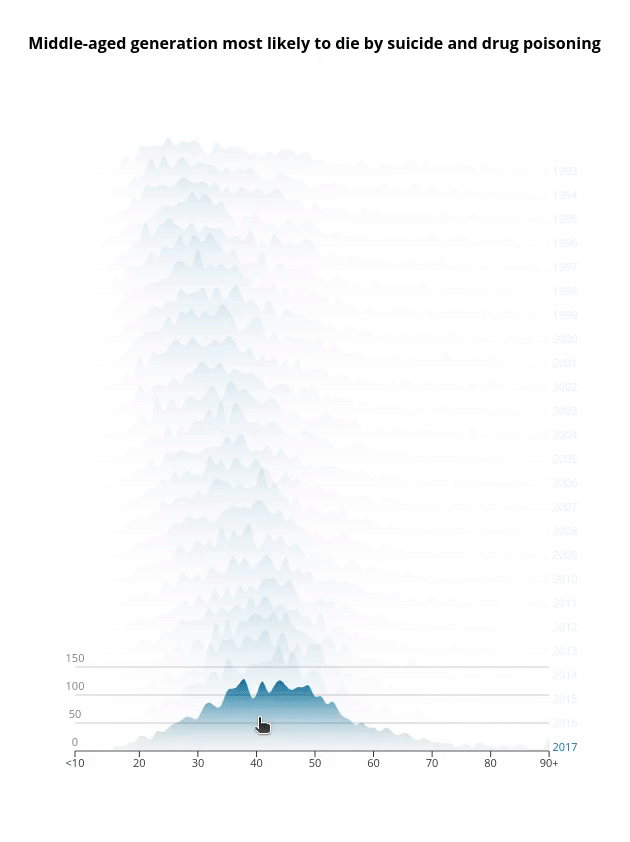
Final interactive ridge plot
What is a Ridge Plot?
Ridge plots are a type of data visualization that display the density of data along a single axis. They are similar to density plots, but differ in that multiple density plots are displayed in a single plot. Ridge plots are useful for displaying the distribution of data across multiple groups or variables in a compact and intuitive way.
In a ridge plot, the x-axis represents the variable being analyzed, while the y-axis represents the density of data at each value of the variable. The density plot for each group or variable is displayed as a ridge, with the ridges stacked on top of each other. The resulting plot looks like a mountain range, with each ridge representing a different group or variable. The width of each ridge represents the density of data at that value, with wider ridges indicating higher density.
Ridge plots offer several benefits over other types of data visualizations. For one, they are highly compact, allowing for multiple density plots to be displayed in a single plot. This can be especially useful for analyzing large datasets with multiple variables. Additionally, ridge plots are intuitive and easy to read, with the ridges providing a clear visual representation of the distribution of data across different groups or variables. Finally, ridge plots can be used to identify differences in distributions between different groups or variables, making them useful for identifying patterns and trends in data.
Overall, ridge plots are a powerful tool for exploring data distributions, and are widely used in a variety of fields, from data science to finance to biology. In the next section, we'll explore how to create an interactive ridge plot using React and D3, two popular libraries for building web-based data visualizations.
Creating a Ridge Plot
We will start with a our dataset, create a SVG container, and then define and draw our ridge plot.
The dataset
As I said earlier, I downloaded the dataset from the original article's page and load it locally to create the plot. As you see in the snippet below, the dataset has 26 columns including Age and years from 1993 to 2017. Each row represent the age and the number of people who have died each year due to drug poisoning and suicide.
Age,1993,1994,1995,1996,1997,1998,1999,2000,2001,2002,2003,2004,2005,2006,2007,2008,2009,2010,2011,2012,2013,2014,2015,2016,2017
<10,6,4,5,4,5,6,5,4,4,2,2,1,3,3,0,5,1,5,0,3,2,2,1,1,1
10,0,0,0,0,0,0,0,1,0,0,1,0,0,0,0,1,0,0,0,0,0,1,0,0,0
11,0,1,0,0,0,0,0,0,0,0,1,0,1,0,0,0,0,0,0,0,0,0,0,0,0

// remaining rows
What we would like to show in the ridge plot is the distribution or density of the number of people at different ages for each year. In other words x-axis represents Age, the variable being analyzed), while the y-axis represents the density of data at each value of the variable Age. But we would like to stack the ridges on top of each other for each year from 1993 to 2017. This makes it highly compact, allowing for multiple ridges to be displayed in a single plot. If I was going to show them separately, then I would have to generate 25 different plots like this:
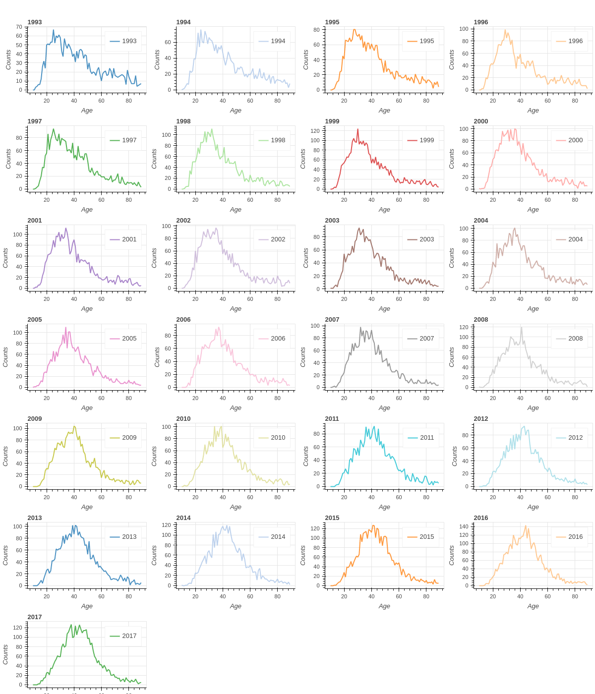
Using line chart for each year increases the number of plots significantly. Additionally, it makes the comparison very difficult.
To easily read the dataset from a URL, I'll be using d3.csv() function. I create a custom React hook to that.
export const useData = (url) => {
  const [data, setData] = useState();
  useEffect(() => {
    csv(url).then((dataset) => setData(dataset));
  }, []);

  return data;
};
Creating the SVG container
The first step in creating our ridge plot is to create an SVG container. In React, we can use the svg element and set its width and height attributes to create an SVG container that is the right size for our plot:
const RidgePlot = () => {
  const { width, height, margin } = dimensions;

  const boundedDimensions = {
    width: width - margin.left - margin.right,
    height: height - margin.top - margin.bottom,
  };

  // Read the dataset
  const data = useData(datasetUrl);

  if (!data) {
    return <div>Loading...</div>;
  }

  return (
    <div>
      <svg className="ridge-svg" width={width} height={height}>
        <g transform={`translate(${margin.left},${margin.top})`}>
          // ridge lines will be drawn here
        </g>
      </svg>
    </div>
  );
};
Drawing the ridge lines
After we have our SVG container, we need to define our scales. However, the dataset with the current format is not very easy to work with. Thus, I transform the dataset.
// Only select year columns
const years = data.columns.slice(1);

const transformData = () => {
  let newData = {};
  let ages = [];
  years.forEach((year) => {
    newData[year] = [];
  });
  data.forEach((item) => {
    years.forEach((year) => {
      newData[year].push({ age: item['Age'], count: +item[year] });
    });
    ages.push(item['Age']);
  });
  return [newData, ages];
};
The transformed dataset is as follows:
Transformed data
where each object of this data has:
A single item in the transformed data
Now we define our accessors and scales based on this new transformed data. Since our x-axis will be different ages and it's a list discrete values, we use d3.scaleBand(). Similarly y-axis will be a list of discrete various years, therefore, d3.scaleBand() would be the solution. Because we want to stack the ridge lines on top of each other, we need another scale that I call it zScale. This scaleLinear() is going to map number of suicides to the height of each ridge line.
// Define accessors
const xAccessor = (d) => d.age;

// Define Scales
const xScale = d3.scaleBand().domain(ages).range([0, boundedDimensions.width]);

const yScale = d3
  .scaleBand()
  .domain(years)
  .range([0, boundedDimensions.height]);

const overlap = -3.5;

const zScale = d3
  .scaleLinear()
  .domain([0, 150])
  .range([0, overlap * yScale.step()]);
Two points:
yScalerange is[0, boundedDimensions.height]because I would like to draw ridge lines from top of the chart to the bottom.- I defined a variable
overlapthat specifies how much ridge lines overlaps each other. The bigger the number, the more overlap. The negative sign flips the ridge lines to have the mountain shape that we expect.
We define an areaGenerator using d3.area() to generate the path elements for each ridge.
const areaGenerator = d3
  .area()
  .curve(d3.curveNatural)
  .x((d) => xScale(xAccessor(d)))
  .y0(0)
  .y1((d) => zScale(d.count));
Let's draw the ridge lines:
<svg className="ridge-svg" width={width} height={height}>
  <g transform={`translate(${margin.left},${margin.top})`}>
    {
      years.map((year, i) => (
        <g key={i} transform={`translate(0,${yScale(year)})`}>
          <path
            d={areaGenerator(newData[year])}
            fill="steelblue"
            opacity="1"
          />
        </g>
      ));
    }
  </g>
</svg>
Here's the ridge plot:
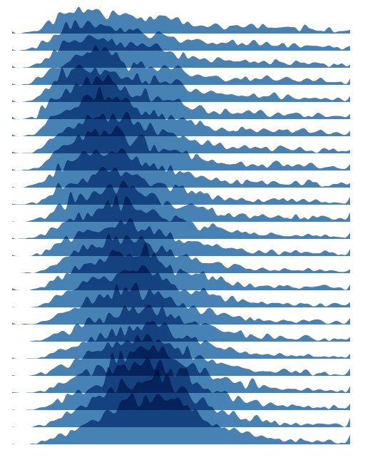
All the areas of ridge lines have the same color that makes the plot not very easily readable. To fix this issue, we can create a <linearGradient>. Creating a linear gradient in SVG is a simple and effective way to add color transitions to your visualizations. In SVG, you can create a linear gradient using the <linearGradient> element, which defines a gradient that transitions between two or more colors in a linear direction. You can find its official documentation here. The colors that the original article has used were quite pretty, and I decided to use the same colors and gradient for my plot.
<defs>
  <linearGradient id="ridgeGradient" x1="0%" y1="0%" x2="0%" y2="110%">
    <stop offset="0%" stopColor="#dadada" />
    <stop offset="0%" stopColor="#0075A3" />
    <stop offset="100%" stopColor="#dadada" stopOpacity="0.1" />
  </linearGradient>
</defs>
Now we need to update the fill attribute of the <path> elements to use this gradient.
<path d={areaGenerator(newData[year])} fill="url(#ridgeGradient)" opacity="1" />
We will have:
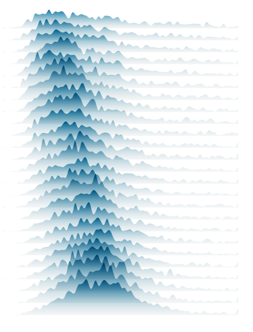
Ridge plot with linear gradient
Creating the Axes
To create the axes, we can utilize the scales we already defined. I defined separate React component for each axis.
We need to move the x axis to the bottom of the chart, so we use transform property to conveniently shift the entire axis and its ticks to the bottom. Then by using the map function, we define each tick and position it accordingly. Finally, we add some styling to change the font size and aligning the text labels.
const AxisBottom = ({ x2, xScale, transform }) => {
  return (
    <g className="x-axis" transform={transform}>
      <line x2={x2} stroke="#635f5d" />
      <g>
        <line
          x1={xScale('<10')}
          x2={xScale('<10')}
          y2={6}
          stroke="currentColor"
        />
        <text x={xScale('<10')} dy=".73" transform="translate(0,15)">
          {'<10'}
        </text>
      </g>
      {xScale
        .domain()
        .slice(2, xScale.domain().length)
        .map((age, i) => {
          return (
            (i + 1) % 10 === 0 && (
              <g key={i}>
                <line
                  x1={xScale(age)}
                  x2={xScale(age)}
                  y2={6}
                  stroke="currentColor"
                />
                <text x={xScale(age)} dy=".73" transform="translate(0,15)">
                  {age}
                </text>
              </g>
            )
          );
        })}
    </g>
  );
};
Similarly, for y axis we have:
const AxisRight = ({ yScale, width }) => {
  return (
    <g>
      {yScale.domain().map((year, i) => (
        <g
          key={i}
          className="ridge-y-axis"
          transform={`translate(${width + 10}, 0)`}
        >
          <text y={yScale(year)} opacity="1">
            {year}
          </text>
        </g>
      ))}
    </g>
  );
};
For x-axis label we simply need to create a text element and place it at the right x and y positions.
<text x={(boundedDimensions.width - margin.right) / 2} y={30}>
  Age
</text>
The SVG container of the RidgePlot component would look like this:
<g transform={`translate(0,${yScale(years[years.length - 1])})`}>
  <AxisBottom x2={xScale(ages[ages.length - 1])} xScale={xScale} />
  <text x={(boundedDimensions.width - margin.right) / 2} y={30}>
    Age
  </text>
</g>

<AxisRight
  yScale={yScale}
  width={boundedDimensions.width}
  hoveredYear={hoveredYear}
/>

{
  years.map((year, i) => (
    <g key={i} transform={`translate(0,${yScale(year)})`}>
      <path
        d={areaGenerator(newData[year])}
        fill="url(#ridgeGradient)"
        opacity="1"
      />
    </g>
  ));
}
And our plot will look like:
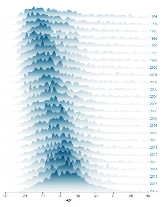
Ridge plot with x and y axes
Enhancing Ridge Plot by Adding Interactivity
Now that we've covered the basics of creating a ridge plot, let's explore some ways we can enhance the visualization to make it more useful and engaging.
One way to enhance the interactive ridge plot is to add interactivity with mouse events. For example, we can add an
onMouseEnterevent to each ridge to display a tooltip that shows the exact density value at that point. Similarly, we can add anonMouseLeaveevent to hide the tooltip when the user moves the cursor away from the ridge. These mouse events can make the interactive ridge plot more intuitive and easier to explore, by providing additional information about the data at each point.Another way to enhance the interactive ridge plot is to add transitions for smoother animation. D3 provides several transition functions that can be used to smoothly animate changes to the visualization, such as changes in the position or width of the ridges. These transitions can make the interactive ridge plot more engaging and visually appealing, by creating a sense of movement and flow.
Finally, we can add axis labels and titles to the interactive ridge plot to provide additional context and clarity. Axis labels can be added to the x-axis and y-axis to indicate the variable being analyzed and the density value, respectively. Similarly, a title can be added to the top of the plot to provide a brief summary of the data being displayed. These labels and titles can make the interactive ridge plot more informative and easier to understand, by providing additional context about the data being analyzed.
We have already added the axes labels. We can add a title and summary of the data and plot that I'll skip it here as the original article already provides so much information in that regard. Therefore, we are going to add a tooltip that shows the range of the number of people who have been died when hovering over a ridge area. It also stands out the hovered ridge area and fade out other ridge areas so reader can focus on that particular ridge. Tooltip includes the x-axis and horizontal grid lines for better readability. Additionally, for smoother animation between standing out and fading out, we add a CSS transition property that changes the opacity accordingly.
We have to revise our code and add the event listeners. We also define a state variable to track which year ridge area is hovered.
const [hoveredYear, setHoveredYear] = useState(-1);

...

const handleMouseEnter = (year) => {
    setHoveredYear(year);
  };
The main changes of tge g element of the SVG container is highlighted below.
<g transform={`translate(${margin.left},${margin.top})`}>
  {hoveredYear === -1 && (
    <g transform={`translate(0,${yScale(years[years.length - 1])})`}>
      <AxisBottom x2={xScale(ages[ages.length - 1])} xScale={xScale} />
      <text x={(boundedDimensions.width - margin.right) / 2} y={30}>
        Age
      </text>
    </g>
  )}
  <AxisRight
    yScale={yScale}
    width={boundedDimensions.width}
    hoveredYear={hoveredYear}
  />
  {years.map((year, i) => (
    <g key={i} transform={`translate(0,${yScale(year)})`}>
      <path
        d={areaGenerator(newData[year])}
        fill="url(#ridgeGradient)"
        opacity={hoveredYear === -1 ? 1 : hoveredYear === +year ? 1 : 0.1}
        onMouseEnter={() => handleMouseEnter(+year)}
        onMouseLeave={() => setHoveredYear(-1)}
      />
      {hoveredYear === +year && (
        <g>
          <AxisBottom x2={xScale(ages[ages.length - 1])} xScale={xScale} />
          {zScale.ticks(3).map((tick, i) => (
            <g key={tick}>
              <line
                x1={0}
                y1={zScale(tick)}
                x2={xScale(ages[ages.length - 1])}
                y2={zScale(tick)}
                stroke="currentColor"
                strokeOpacity=".2"
                pointerEvents="none"
              />
              <text y={zScale(tick) - 5} opacity="0.5">
                {tick}
              </text>
            </g>
          ))}
        </g>
      )}
    </g>
  ))}
</g>
Now we add CSS hover properties to our styles.css or directly inside our component, which I did the former.
.ridge-svg path:hover {
  cursor: pointer;
  transition: opacity 0.3s;
}
Here's the result.
Interactive ridge plot
Use Cases for Interactive Ridge Plots
Interactive ridge plots are a versatile data visualization tool that can be applied to a wide range of use cases in different fields. Here are some examples of how interactive ridge plots can be used to analyze and visualize different types of data:
Financial Analysis: Interactive ridge plots can be used to analyze stock market data, such as the daily returns of different stocks or indices. By displaying the density of returns for each stock or index, an interactive ridge plot can help investors identify patterns and trends in the market, and make more informed investment decisions.
Healthcare Analysis: Interactive ridge plots can be used to analyze patient data, such as the distribution of body mass index (BMI) scores across different demographics. By displaying the density of BMI scores for each demographic group, an interactive ridge plot can help healthcare professionals identify patterns and trends in patient health, and develop more effective treatment plans.
Marketing Analysis: Interactive ridge plots can be used to analyze customer data, such as the distribution of purchase amounts for different customer segments. By displaying the density of purchase amounts for each segment, an interactive ridge plot can help marketers identify patterns and trends in customer behavior, and develop more effective marketing strategies.
Climate Analysis: Interactive ridge plots can be used to analyze climate data, such as the distribution of temperature or rainfall across different regions. By displaying the density of temperature or rainfall values for each region, an interactive ridge plot can help climate scientists identify patterns and trends in climate change, and develop more accurate climate models.
You can find the code for this post as well as all other posts' code at this repo.
Thank you for reading this blog. You can follow me on Linkedin or Twitter, and please reach out if you have any comments, or interested in any custom visualization.