
Weather has a significant impact on our daily lives, from deciding what to wear to planning outdoor activities. Understanding weather patterns and trends can be crucial in making informed decisions. In this blog post, we will explore a weather dataset and create visualizations to better understand the types of weather and their trends over time. The original idea came to my mind while I was reading an article (Practice perfect) of the The Plot newsletter. The article was about describing whatever you're trying to show clearly in one sentence. The author created a visualization illustrating her fitness routine in 2022. The visualization caught my eyes instantaneously as it was quite beautiful. I got inspired by that and decided to create a similar visualization. However, I didn't have fitness data, therefore I chose weather data instead.
The dataset used in this project is part of a bigger weather dataset that I originally downloaded from here and contains information about the minimum and maximum temperatures, wind, and the type of weather for a specific location and time period. Using this data, we will create a radar plot that provides a clear picture of the weather patterns and trends. The radar plot is an ideal choice for this type of data as it allows us to visualize multiple variables in a single graph and compare them effectively.
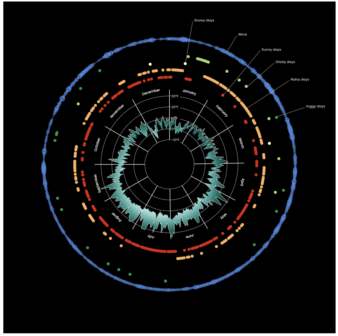
Final visualization of weather dataset
We will need to start by setting up the React project (I will skip this part because I have already covered it in my previous posts), importing the data, and creating the radar plot using D3, . Then, we will add additional features to the radar plot to provide more context and insights into the data. By the end of this post, you will have a better understanding of how to use React and D3 to visualize weather data and gain insights into its trends and patterns.
Importing the Weather Data
With the React project set up, you can now import the weather dataset. You can use JavaScript's built-in fetch API or a library like Axios to retrieve the data from a server or a local file. I created a Github Gist here and uploaded the file, so we can directly download and read the file in our project. We can use Fetch API or d3.csv() method to read the file.
import { csv } from 'd3';

export const useWeatherData = () => {
  const [data, setData] = useState();
  useEffect(() => {
    csv(
      'https://gist.githubusercontent.com/mallahyari/1e0a70ed89e553ecf2db7e24a9b91d65/raw/02d48c2d42515dd892c41cca13c34cc1d0c09ebe/weather_fake_data.csv'
    ).then((dataset) => setData(dataset));
  }, []);

  return data;
};
Preparing the Data for Visualization
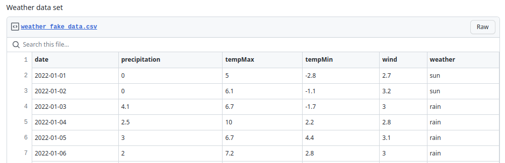
After importing the data, you'll need to clean and prepare it for visualization. This may involve removing any missing values, converting data types, or aggregating the data. One of the visual data elements that I will draw is different weather types. Therefore, I needed to aggregate the data (group by) weather column, that you will see in the later section. You can see a snippet of the dataset including its columns:
Code Explanation for Creating the Radar Plot with D3 and React
The first step in creating the radar plot is to set up the D3 scales and axes. The scales will be used to map the data values to the chart, and the axes will be used to define the boundaries of the chart. I defined a WeatherPlot.js file and added my component.
// import necessary modules
const dimensions = {
width: 1100,
height: 1100,
margin: { top: 50, right: 60, bottom: 50, left: 60 },
};
export const WeatherPlot = () => {
const { width, height, margin } = dimensions;
const boundedDimensions = {
width: dimensions.width - margin.left - margin.right,
height: dimensions.height - margin.top - margin.bottom,
};
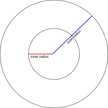
const boundedRadius = boundedDimensions.width / 2;
const outerRadius = (boundedDimensions.width / 2) * 0.5;
const innerRadius = outerRadius / 3;
return (
<div>
<svg
width={width}
height={height}
style={{ backgroundColor: '#000' }}
></svg>
</div>
);
};
Creating the Scales
If you look at the data, it shows one year of data with other features. We are going to show temperatures over time, so we need two scales. One scale for date and another one for temperature. The scale for date transforms dates into angles and other scale maps temperature numbers into distance from the center of the circle or the plot. I define my scales as follows:
// Create angle scale for mapping the dates to angles
  const angleScale = d3
    .scaleTime()
    .domain(d3.extent(data, dateAccessor))
    .range([0, 2 * Math.PI]);

  // Create radius scale for mapping min and max temperatures to distances
  const radiusScale = d3
    .scaleLinear()
    .domain(
      d3.extent([...data.map(tempMinAccessor), ...data.map(tempMaxAccessor)])
    )
    .range([innerRadius, outerRadius])
    .nice();
    ```
The domain of angleScale is the range of [min date, max date] and range is the entire circle, which is [0, 2 * Math.PI]. For my radiusScale, the domain and range will be [min temperature, max temperature] and [inner radius. outer radius], respectively.
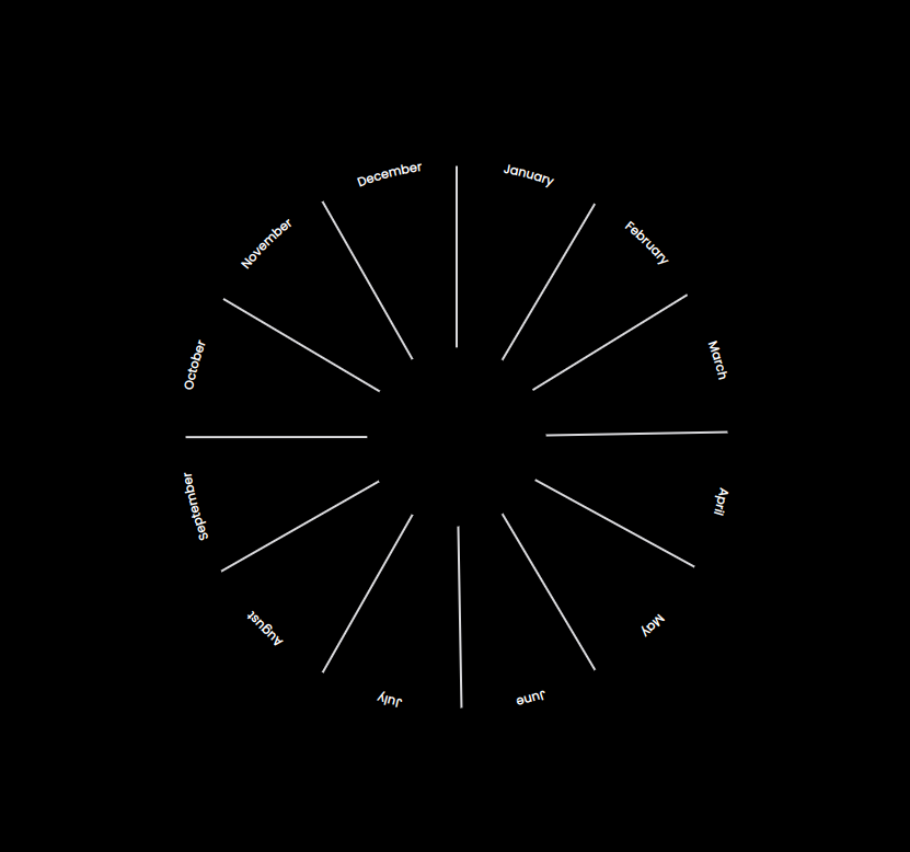
Creating Grid Lines and Ticks
Let's create a grid line for each month and also create text labels of months. We need a function to covert angle to [x, y] point to be able to draw grid lines. Also, we need names of months. We can define an array with months names, however, instead of hardcoding, let's get them from our angle scale domain using d3.timeMonths() function.
// Define month names for creating text labels on the plot
const months = d3.timeMonths(...angleScale.domain());

// Define a function to convert angle into position
const getCoordinatesForAngle = (angle, radius, offset = 1) => {
  return d3.pointRadial(angle, radius * offset);
};
Now that we have what we need, let's draw the grid lines with labels.
{
  months.map((m, i) => {
    const angle = angleScale(m);
    const angleOffset = Math.PI / 12;
    const [x1, y1] = getCoordinatesForAngle(angle, innerRadius);
    const [x2, y2] = getCoordinatesForAngle(angle, outerRadius, 1.01);
    const [labelX, labelY] = getCoordinatesForAngle(
      angle + angleOffset,
      outerRadius,
      1.05
    );
    return (
      <g key={i}>
        <line
          x1={x1}
          y1={y1}
          x2={x2}
          y2={y2}
          strokeWidth={2}
          className="grid-line"
        />
        <text x={labelX} y={labelY} textAnchor="middle" className="tick-label">
          {d3.timeFormat('%B')(m)}
        </text>
      </g>
    );
  });
}
Here's the output plot:
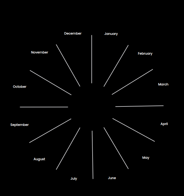
It's pretty cool, isn't it? ;)
Although text labels look nice, but instead of being horizontal, I would like them to rotate around the circle. Therefore, I need to use <textPath>, it allows us to render text along the shape of a <path>. Please check this link for complete description and examples.
Nevertheless, the idea is I have to create an arc shape path and then render my text label using that path. I need to create arc path between each two consecutive months, and then draw my text label along that path.
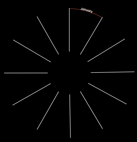
Example of <textPath>
To be able to get month intervals, I will use d3.utcMonth.offset(date[, step]).
const monthsTextPath = months.map((d) => [d, d3.utcMonth.offset(d, 1)]);
Let's replace the months text labels generated before with these new ones.
{
  monthsTextPath.slice(0, 1).map(([a, b], i) => {
    const id = `month-path-${i}`;
    const angleA = angleScale(a);
    const angleB = angleScale(b);
    const movePoint = getCoordinatesForAngle(angleA, outerRadius);
    const arcPoint = getCoordinatesForAngle(angleB, outerRadius);

    return (
      <g key={`g-${i}`}>
        <path
          key={id}
          id={id}
          d={`
            M${movePoint}
            A${outerRadius},${outerRadius} 0,0,1 ${arcPoint}`}
          stroke="tomato"
        />
        <text
          key={`month-textPath-${i}`}
          textAnchor="middle"
          className="tick-label"
        >
          <textPath startOffset="50%" href={`#${id}`}>
            {d3.utcFormat('%B')(a)}
          </textPath>
        </text>
      </g>
    );
  });
}
Here's the result:
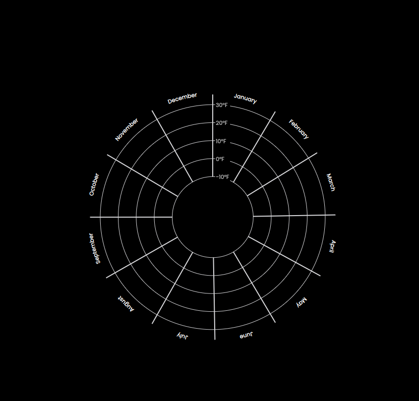
Next step is to create ticks for our plot, which is easily done via our radiusScale.ticks() function.
// Define ticks for our plot
const tempTicks = radiusScale.ticks(5);
I use the ticks to draw tick values and circles.
{
  tempTicks.map((t, i) => (
    <g key={i}>
      <circle r={radiusScale(t)} className="grid-line" />
      <rect x={5} y={-radiusScale(t) - 10} width={30} height={20} fill="#000" />
      <text x={6} y={-radiusScale(t) + 5} className="tick-label-temperature">
        {`${d3.format('.0f')(t)}\u00b0F`}
      </text>
    </g>
  ));
}
Let's see the outcome:
Drawing the Area Radial
We need d3.areaRadial() to draw the actual plot. It requires angle(), innerRadius() and outerRadius() to be set. By setting them and passing the dataset it generates the <path> for us.
// Define generators for shape of the plot
const areaGenerator = d3
  .areaRadial()
  .angle((d) => angleScale(dateAccessor(d)))
  .innerRadius((d) => radiusScale(tempMinAccessor(d)))
  .outerRadius((d) => radiusScale(tempMaxAccessor(d)));

// inside SVG tag
<path d={areaGenerator(data)} fill="tomato" className="area" />;
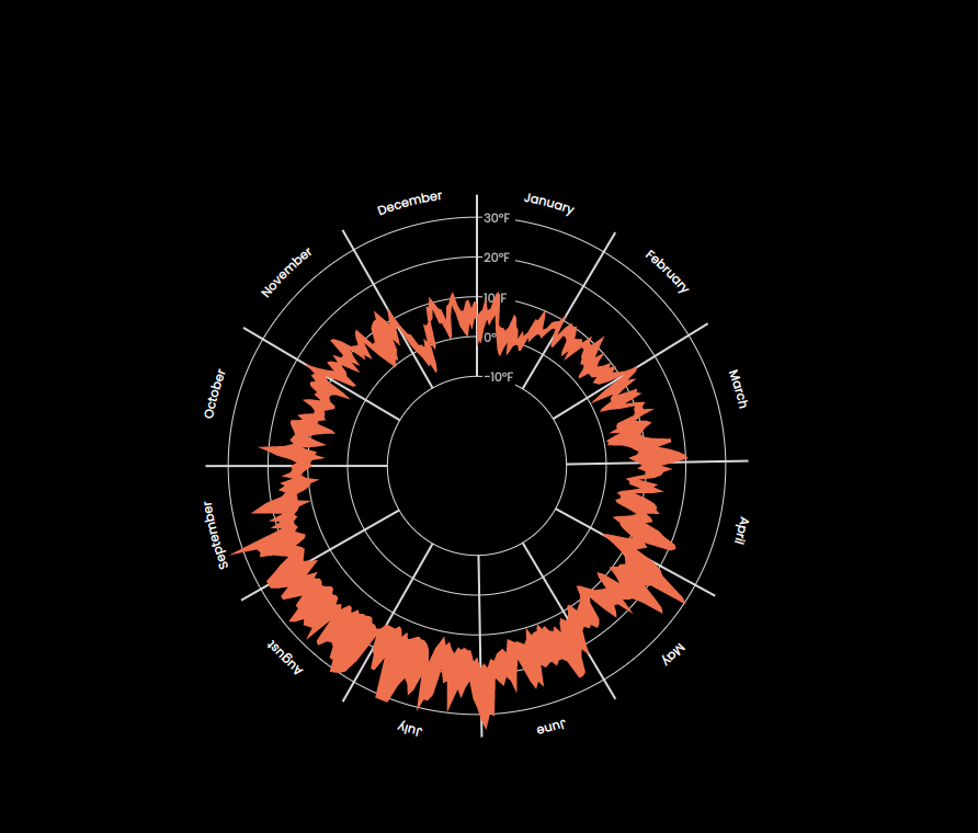
We can draw a line on the outer side or inner side of plot to make it stand out more. The code below will draw on the outer side of the plot, you can change the lineOuterRadius() to lineInnerRadius() to draw inner line, or draw both if you like. It can be easily achieved in two ways.
// Select METHOD 1 OR METHOD 2
// METHOD 1
const lineGenerator = areaGenerator.lineOuterRadius();

// METHOD 2
const lineGenerator = d3
  .lineRadial()
  .curve(d3.curveCardinal)
  .angle((d) => angleScale(dateAccessor(d)))
  .radius((d) => radiusScale(tempMaxAccessor(d)));

// In SVG tag
<path
  d={lineGenerator(data)}
  fill="none"
  stroke="#f8f9fa"
  className="line-radial"
/>;
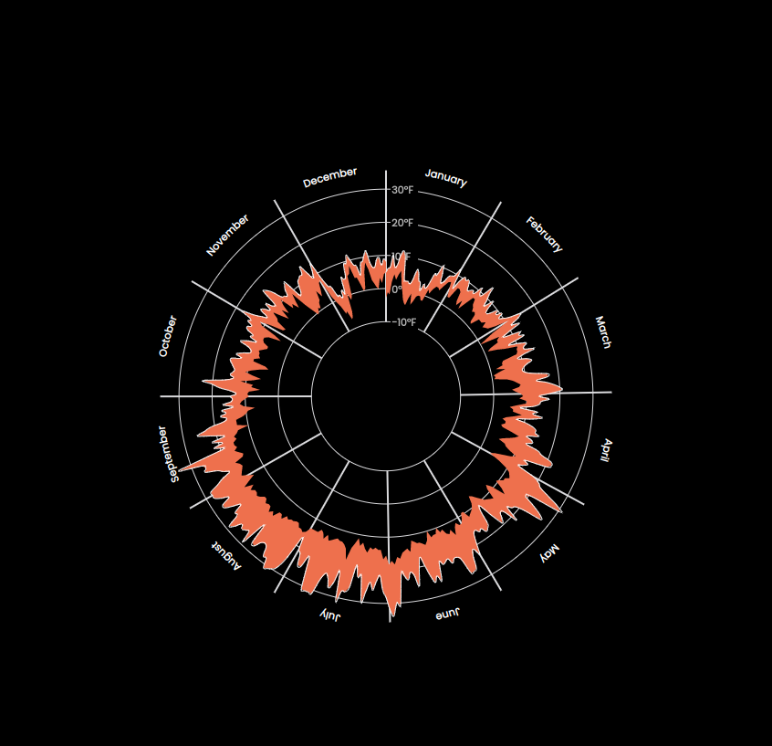
Radar plot with outer line
Changing the Color using RadialGradient
I'd like to change the color of the plot and use a gradient color instead to make it look even better. <radialGradient> is the right choice because our plot is a radial plot. You can read its documentation to learn more about different gradients.
The important attributes are id, offset and stop-color. We can define our <radialGradient> in the <def> tag. The <def> tag job is to store graphical objects that will be used later again. You can think of it as browser localStorage.
<defs>
  <radialGradient id="temp-gradient">
    {d3.range(numOfStops).map((i) => (
      <stop
        key={i}
        offset={`${(i / (numOfStops - 1)) * 100}%`}
        stopColor={gradientColorScale(i / (numOfStops - 1))}
      />
    ))}
  </radialGradient>
</defs>
To select a gradient color, I am going to use one of d3 color schemes
// Create gradient color for area path
const gradientColorScale = d3.interpolateBrBG;
Now I'll update my area path fill attribute to use my gradient color.
<path d={areaGenerator(data)} fill={`url(#temp-gradient)`} className="area" />
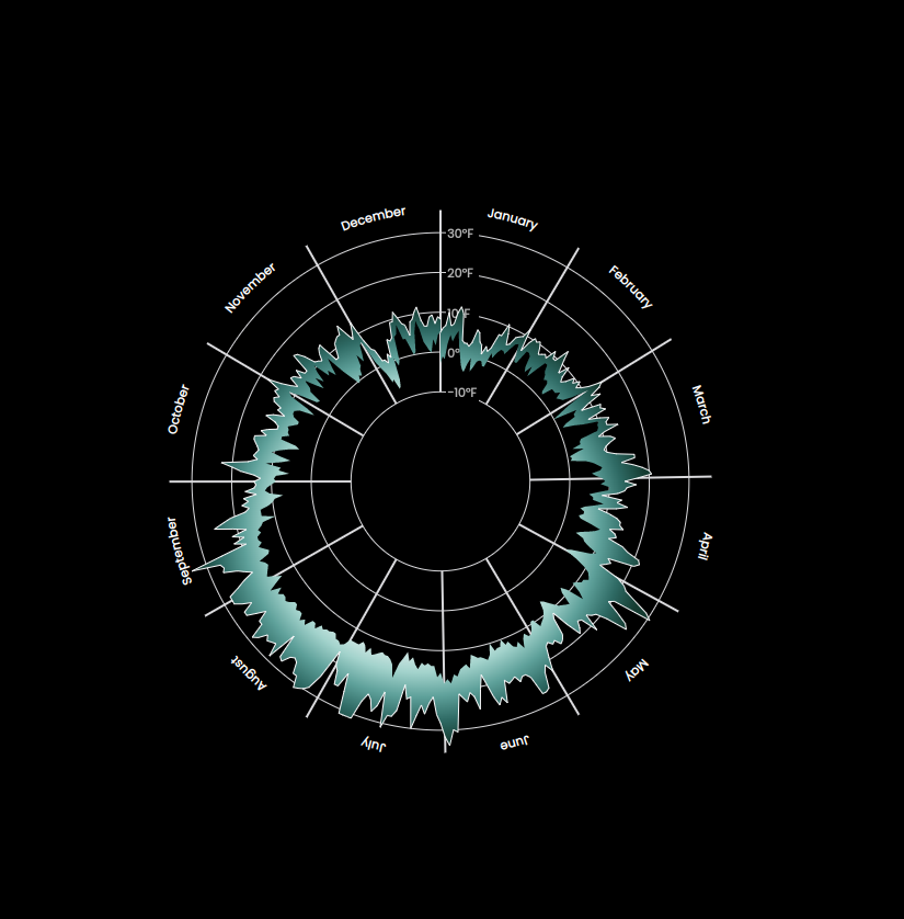
Radar plot with radial gradient
Drawing Weather Types
Awesome! We're done with main radar plot. However, I would like to draw weather types and the wind speed attributes into this plot as well.
We need to transform out data, i.e. group the data by various weather types. Additionally, I define offset values for each type, so we can draw them at different distances to prevent overlap.
// Group by the data based on `weather` types
const dataGroupedByWeather = d3.group(data, (d) => d.weather);

// Create offsets to easily draw circles with certain offset of the main radius.
const weatherTypes = Array.from(dataGroupedByWeather.keys());
const weatherTypeOffsets = weatherTypes.map((t, i) => ({
  type: t,
  offset: 1.18 + i * 0.1,
}));

const windOffset = 1.7;
I also define another scale to be able to change the size of the <circle> elements based on the wind speed. The higher the speed, the bigger the circle. However, the size of the circle and its radius grow at different rates. What I mean is that if we multiply the radius of a circle by 2, its area becomes 4 times larger.
So what is the ratio or radius to the area of a circle?!
Therefore, we'd rather use d3.scaleSqrt() instead of a linear scale.
// Create radius scale for wind numbers
const windRadiusScale = d3
  .scaleSqrt()
  .domain(d3.extent(data, windAccessor))
  .range([2, 10]);
I considered the range (i.e. radii of the circles) to be [2, 10]. I need five distinctive colors for weather types, so I used discrete colors:
// Define colors for color coding different types of weather
const weatherColors = d3.schemeRdYlGn[5];
Putting together all the pieces, we will have:
{
  weatherTypes.map((wt, i) =>
    dataGroupedByWeather.get(wt).map((d, j) => {
      const angle = angleScale(dateAccessor(d));
      const [x, y] = getCoordinatesForAngle(
        angle,
        outerRadius,
        weatherTypeOffsets[i].offset
      );

      return (
        <g key={`${wt}-${i}${j}`}>
          <circle
            cx={x}
            cy={y}
            r={5}
            fill={weatherColors[i]}
            className={`${wt}-circle`}
          />
        </g>
      );
    })
  );
}

{
  data.map((d, i) => {
    const angle = angleScale(dateAccessor(d));
    const [x, y] = getCoordinatesForAngle(angle, outerRadius, windOffset);

    return (
      <g key={`wind-${i}`}>
        <circle
          cx={x}
          cy={y}
          r={windRadiusScale(windAccessor(d))}
          className={`wind-circle`}
        />
      </g>
    );
  });
}
And our plot looks like this:
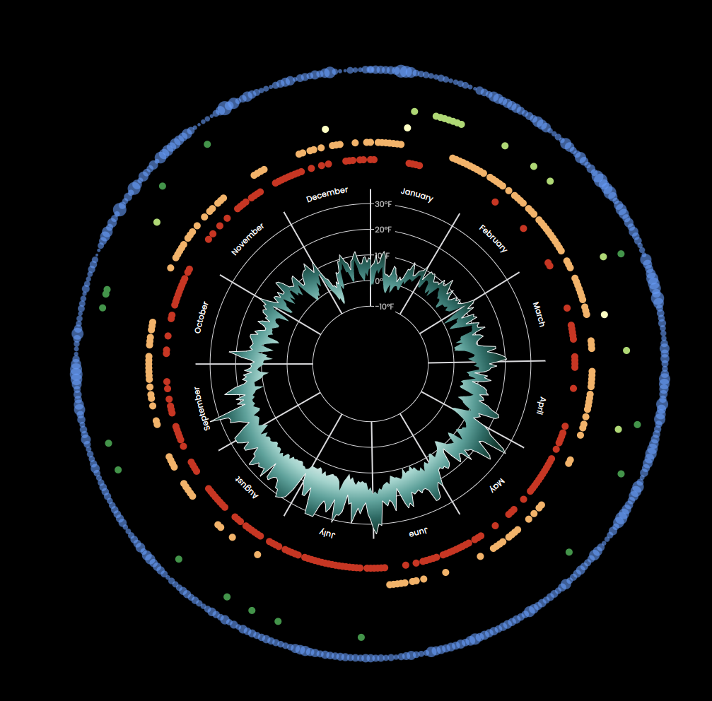
Radar plot with weather types
Adding Annotations to the Plot
We're almost done. The only thing left out is to annotate our plot, so if someone looks at our plot they can easily figure out all the information it's offering.
To put it into simple words, annotation is essentially, some textual content along with some line to guide the text. Therefore, we need to draw some <text> and <line> elements.
Because we need several annotations, i.e. drawing several <line> and <text> elements, I defined a function to make it straightforward. This function input will be angle, offset and text and returns an object having x and y positions and text for drawing line and text.
// Define a function for creating text annotations on the plot
const drawAnnotation = (angle, offset, text) => {
  const [x1, y1] = getCoordinatesForAngle(angle, outerRadius, offset);
  const [x2, y2] = getCoordinatesForAngle(angle, outerRadius, 2);

  return { x1, x2, y1, y2, text };
};
Let's create our annotations:
// Define annotation for various type of information
const sunAnnotation = drawAnnotation(
  Math.PI * 0.21,
  weatherTypeOffsets.find((el) => el.type === 'sun')['offset'],
  'Sunny days'
);
const rainAnnotation = drawAnnotation(
  Math.PI * 0.3,
  weatherTypeOffsets.find((el) => el.type === 'rain')['offset'],
  'Rainy days'
);
const snowAnnotation = drawAnnotation(
  Math.PI * 0.05,
  weatherTypeOffsets.find((el) => el.type === 'snow')['offset'],
  'Snowy days'
);
const drizzleAnnotation = drawAnnotation(
  Math.PI * 0.25,
  weatherTypeOffsets.find((el) => el.type === 'drizzle')['offset'],
  'Drizzly days'
);
const fogAnnotation = drawAnnotation(
  Math.PI * 0.367,
  weatherTypeOffsets.find((el) => el.type === 'fog')['offset'],
  'foggy days'
);
const windAnnotation = drawAnnotation(Math.PI * 0.15, windOffset, 'Wind');
I then created a React component called Annotation, which basically draws the line and text, given the annotation data.
const Annotaion = ({ annotationData }) => (
  <g>
    <line
      x1={annotationData.x1}
      x2={annotationData.x2}
      y1={annotationData.y1}
      y2={annotationData.y2 + 10}
      className="annotation-line"
    />
    <text
      x={annotationData.x2 + 5}
      y={annotationData.y2 + 10}
      className="annotation-text"
    >
      {annotationData.text}
    </text>
  </g>
);
And we're done! Here's the final plot:
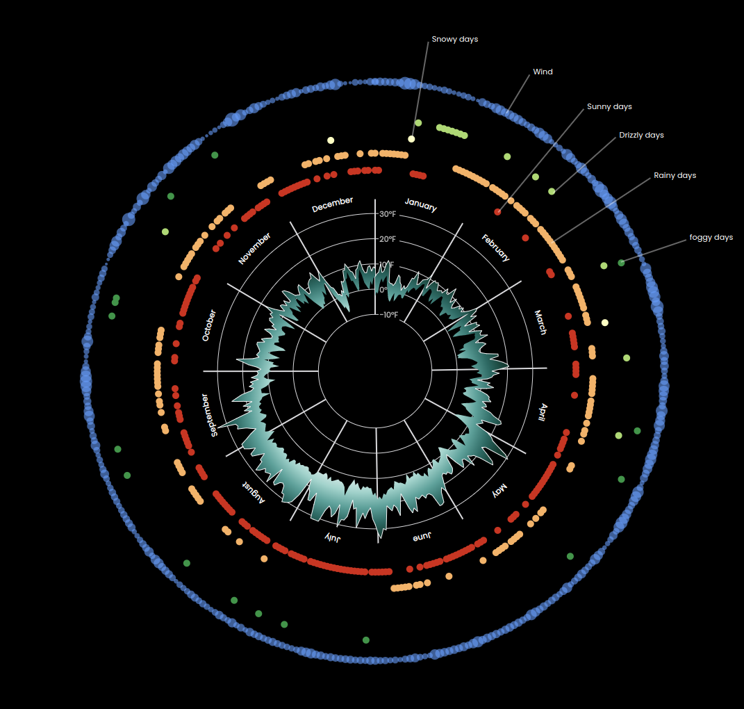
Radar plot final version
You can find all the code at this repo along with previous posts' code.
Thank you for reading this blog. You can follow me on Linkedin or Twitter, and please reach out if you have any comments, or interested in any custom visualization.